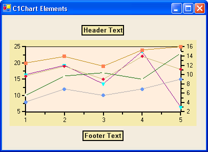
Here is how the Header and Footer elements appear in C1Chart.
The header and footer elements are used to display descriptive information about the chart. They are controlled by the Header and Footer properties. Both properties return a Title object that contains the following main properties:
|
Property |
Description |
|
Contains text displayed in the title (header or footer). | |
|
Contains properties that set the font, orientation, colors, and border of the title. | |
|
Determines the position of the title. | |
|
Determines whether the title is visible. |
C1Chart sizes and positions the titles automatically, based on their contents and how theCompass property is set. Title object positions are customized using the SizeDefault and LocationDefault properties (negative values activate the automatic sizing and positioning).
Creating header and footer elements
The Chart header and footer elements can be created programmatically through its Title object or they can be created at design time through the Chart's Properties window, Chart Properties designer, or by Chart's SmartDesigner.
The simplest way of creating them is through the Chart's SmartDesigner. For more information on creating header or footers through the Chart's SmartDesigner, see Add a Chart Header or Add a Chart Footer.
Customizing header and footer elements
The header and footer elements' text and aligment, position, border, colors, and font can be customized using the Title's properties. Additionally, light patterns, shadows, and custom colors can be added to the header and footer elements using the VisualEffects designer.
Please refer to Customizing Chart Elements for more information on the properties and tools used to enhance 2D Chart's elements.
Send comments about this topic to ComponentOne. Copyright © ComponentOne LLC. All rights reserved. |