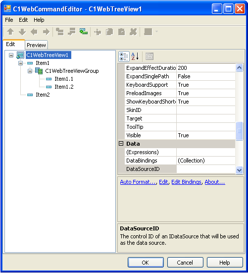
You have complete control to quickly customize your C1WebTreeView by using the C1WebCommandEditor-C1WebTreeView. The C1WebCommandEditor-C1WebTreeView contains the following types of properties:
C1WebTreeView
When C1WebTreeView is selected in the tree view of the C1WebCommandEditor, it contains the following types of properties:
C1WebTreeView Properties
· C1WebTreeView Accessibility and Appearance
properties 
The properties specify the C1WebTreeView's accessibility and appearance. The C1WebMenu1's properties and their description are listed below:
|
Property |
Description |
|
AccessKey |
Keyboard short-cut used by the control. |
|
TabIndex |
The tab order of the element. The tab order is the order that the focus is moved when the Tab key is pressed. |
|
BackColor |
Color of the background of the control. |
|
BackImageUrl |
Gets or sets the URL of the background image. |
|
BorderColor |
Color of the border around the control. |
|
BorderStyle |
Style of the border around the control. |
|
BorderWidth |
Width of the border around the control. |
|
CallbackWaitControlID |
Identifies a control that should be shown during callback to provide visual feedback. |
|
CallbackWaitImageUrl |
Gets the Url of an image that should be shown during a callback to provide visual feedback. |
|
CssClass |
CSS class name applied to the control. |
|
Font |
The font used for the text within the control. |
|
ForeColor |
Color of the text within the control. |
|
GroupPadding |
Default space between the group's border and items in the group. |
|
IconBarWidth |
Sets or returns the width of the icon bar drawn on the side of the groups. |
|
ItemPadding |
Default padding for the link items. |
|
ItemSpacing |
Default spacing between items in a group. |
|
Padding |
Space between the control's border and its inner content. |
|
ShowCheck boxes |
Gets or sets a value that indicates whether items will display a check box in the TreeView control. |
|
ShowLines |
Gets or sets a value indicating whether lines connecting child nodes to parent nodes are displayed. |
· C1WebTreeView Behavior properties
The properties specify the C1WebTreeView's behavior. The C1WebTreeView's behavior properties and their description are listed below:
|
Property |
Description |
|
AllowMultipleSelect |
If false, only a single item can be selected in the group. |
|
AllowSelectItem |
If true, one or more items in the group can be selected. |
|
AllowUnselectItem |
If true, the user can unselect the item by the second click on it. |
|
AlwaysHasSelected |
If true and if AllowSelectItem = true at minimum one item in a group is selected. |
|
AutoPostBack |
Sets or retrieves a value that indicates whether or not the control posts back to the server each time a user interacts with the control. |
|
CausesValidation |
Whether to trigger ASP.NET page validation when a node is selected. |
|
ClientDir |
Points to the directory which contains the client script. |
|
Enabled |
Enabled state of the control. |
|
EnableTheming |
Indicates whether the control can be themed. |
|
EnableViewState |
Whether the control automatically saves its state for use in round-trips. |
|
ExpandEffect |
Gets the expand effect for the C1WebTreeView object. |
|
ExpandEffectDuration |
The duration of the ExpandEffect in ms. The default value is 200 ms. |
|
ExpandSinglePath |
If true, treeview collapses all other paths when expanding a node. The default value is False. |
|
KeyboardSupport |
Whether to enable keyboard control of this Control. |
|
PreloadImages |
Specifies whether to preload images used in the control. |
|
ShowKeyboardShortcuts |
Whether to display the shortcut of an item next to the text of the item. |
|
SkinID |
The SkinId of the control skin that provides the skin of the control. |
|
Target |
Default target (frame or window) to use when navigating. |
|
Tooltip |
The ToolTip displayed when the mouse is over the control. |
|
Visible |
Indicates whether the control is visible and rendered. |
· C1WebTreeView Data, Layout, and Misc
properties
The properties specify the C1WebTreeView's data, layout, and Misc properties. The C1WebTreeView's data, layout, and Misc properties and their description are listed below:
|
Property |
Description |
|
Expressions |
Gets or sets the data-binding expressions that are bound to properties of this control. |
|
DataBindings |
Data bindings for items in the control. |
|
DataSourceID |
The control ID of an IDataSource that will be used as the data source. |
|
Height |
The height of the control. |
|
Width |
The width of the control. |
|
ID |
Programmatic name of the control. |
· Style properties of the C1WebCommandEditor –
C1WebTreeView
The properties specify the C1WebMenu's Style properties. The C1WebMenu's Style properties and their description are listed below:
|
Property |
Description |
|
DisabledGroupStyle |
Default style for the disabled groups. |
|
DisabledItemStyle |
Default style for the child items in the disabled state. |
|
GroupStyle |
Default style for the groups. |
|
ItemStyle |
Default style for the child items in the normal state. |
|
MouseOverItemStyle |
Default style for the child items when the mouse hovers over it. |
|
MouseOverSelectedItemStyle |
Default style for the child items when the mouse hovers the selected item. |
|
ScrollAreaStyle |
Default style for the scrollable area in the groups. |
|
SelectedItemStyle |
Default style for the child items in the selected state. |
|
SeparatorStyle |
Default style for the separators. |
|
SpecialSymbolStyle |
Default style for special symbols in the tree view. |
C1WebTreeViewGroup Properties
When C1WebTreeViewGroup is selected in the tree view of the C1WebCommandEditor, it contains the following types of properties:
· C1WebTreeViewGroup Accessibility and Appearance
properties
The properties specify the C1WebTreeViewGroup's appearance. The C1WebTreeViewGroup's properties and their description are listed below:
|
Property |
Description |
|
GroupPadding |
Default space between the group's border an items in the group. |
|
IconBarWidth |
Sets or returns the width of the icon bar drawn on the side of the groups. |
|
ItemPadding |
Gets or sets default space between the item's border and content. |
|
ItemSpacing |
Gets or sets the space between the items in the group. |
|
ShowCheck boxes |
Gets or sets a value that indicates whether the items will display check boxes in the group. |
|
ShowLines |
Gets or sets a value indicating whether the lines connecting the child nodes to the parent nodes are displayed in the group. |
|
WrapText |
Gets or sets a value that indicates whether the item's text is wrapped. |
· C1WebTreeViewGroup Behavior properties
The properties specify the C1WebTreviewGroup's behavior. The C1WebTreeViewGroup's behavior properties and their description are listed below:
|
Property |
Description |
|
AllowMultipleSelect |
If false, only a single item can be selected in the group. |
|
AllowMultipleSelectInControl |
If false, only a single item can be selected in all of the groups in the control. |
|
AllowSelectItem |
If true, one or more items in the group can be selected. |
|
AllowUnselectItem |
If true, the user can unselect the item by the second click on it. |
|
AlwaysHasSelected |
If true and if AllowSelectItem = true at minimum one item in a group is selected. |
|
Collapsed |
Gets or sets a value indicating whether or not the group is collapsed. |
|
Enabled |
Gets or sets a value indicating whether the group is enabled. |
|
EnableExpandCollapse |
Gets or sets a value indicating whether the user can expand or collapse the group by double-clicking on the header or clicking on the indicator image. |
|
Tooltip |
Gets or sets the ToolTip text displayed when the mouse pointer rests over the group. |
|
Visible |
Gets or sets a value indicating whether or not the group is visible. |
· C1WebTreeView Style properties
The properties specify the C1WebTreeViewGroup's Style properties. The C1WebTreeViewGroup's Style properties and their description are listed below:
|
Property |
Description |
|
DisabledGroupStyle |
Style for the disabled group. |
|
DisabledItemStyle |
Style for the child items in the disabled state. |
|
GroupStyle |
Style for the group. |
|
ItemStyle |
Style for the child items in the normal state. |
|
MouseOverItemStyle |
Style for the child items when the mouse hovers over it. |
|
MouseOverSelectedItemStyle |
Style for the child items when the mouse hovers the selected item. |
|
SelectedItemStyle |
Style for the child items in the selected state. |
|
SeparatorStyle |
Style for the separators. |
|
SpecialSymbolStyle |
Default style for special symbols in the tree view group. |
C1WebTreeViewItem Properties
When a link item is selected in the tree view of the C1WebCommandEditor, it contains the following types of properties:
· C1WebTreeViewItem Appearance properties
The properties specify C1WebTreeView link items' appearance. The link items properties and their description are listed below:
|
Property |
Description |
|
IconBarWidth |
Sets or returns the width of the icon bar drawn on the side of the groups. |
|
ItemPadding |
Space between the item's border and content. |
|
NavigateUrl |
Gets or sets the URL to link to when the hyperlink is clicked in the tree item. |
|
ShowCheck box |
Gets or sets a value that indicates whether the item will display a check box. |
|
Text |
Gets or sets the text displayed for the item in a control. |
|
Tooltip |
Gets or sets the ToolTip text displayed when the mouse pointer rests over the item. |
· C1WebTreeViewItem Behavior properties
The properties specify the C1WebTreeView link items' behavior. The C1WebTreeView link items' behavior properties and their description are listed below:
|
Property |
Description |
|
CausesValidation |
Determines whether validation is performed when the item is clicked. |
|
ClientScripts |
Collection of client-side scripts associated with the item. |
|
CommandArgument |
Gets or sets an optional parameter passed to the ItemClick and ItemSelected events of the component along with the associated CommandName. |
|
CommandName |
Gets or sets the command name associated with the Item passed to the ItemClick and ItemSelected events of the component. |
|
Enabled |
Gets or sets a value indicating whether the item is enabled. |
|
PopulateOnDemand |
Gets or sets a value that indicates whether the item is populated dynamically. |
|
Selected |
Gets or sets a value indicating whether the current item is selected. |
|
Target |
Gets or sets the target window or frame to display the Web page content linked when the C1WebLinkItem is clicked. |
|
Visible |
Gets or sets a value indicating whether or not the item is visible. |
|
WrapText |
Gets or sets a value that indicates whether the text of the item is wrapped. |
|
KeyboardShortcut |
String representing keyboard shortcut to perform an action on this item. |
· C1WebTreeViewItem Style properties
The properties specify the C1WebTreeViewGroup's Style properties. The C1WebTreeViewGroup's Style properties and their description are listed below:
|
Property |
Description |
|
DisabledItemStyle |
Style for the item in the disabled state. |
|
ItemStyle |
Style for the item in the normal state. |
|
MouseOverItemStyle |
Style for the item when the mouse hovers over it. |
|
MouseOverSelectedItemStyle |
Style for the item when the mouse hovers over the selected item. |
|
SelectedItemStyle |
Style for the item in the selected state. |
|
SpecialSymbolStyle |
Style for special symbols in the tree view item. |
C1WebContentItem Properties
When a Content item is selected in the tree view of the C1WebCommandEditor, it contains the following types of properties:
· C1WebContentItem Appearance properties
The properties specify C1WebTreeView content items' appearance. The link items properties and their description are listed below:
|
Property |
Description |
|
ItemPadding |
Space between the item's border and content. |
· C1WebContentItem Style properties
The properties specify the C1WebTreeView content items' Style properties. The Content Items' properties and their description are listed below:
|
Property |
Description |
|
BackColor |
Background color of the controls applied with this style. |
|
BackImageUrl |
The URL of the background image. |
|
BorderColor |
Border color of the controls applied with this style. |
|
BorderStyle |
Style of the border of controls applied with this style. |
|
BorderWidth |
Thickness of the border around the controls applied with this style. |
|
CssClass |
CSS class name applied to the user of this style. |
|
Font |
The font used for text in the controls applied with this style. |
|
ForeColor |
The foreground color of the controls applied with this style. |
|
Height |
The height of the controls applied with this style. |
|
ImageTextSpacing |
Specifies the spacing between the item's image and text. |
|
ImageUrl |
The URL of the image to use in an icon place. |
|
ItemImagePosition |
Specifies the position of an image relative to the item's text. |
|
LeftBorderImageUrl |
The URL of the left border image. |
|
RightBorderImageUrl |
The URL of the right border image. |
|
Width |
The width of the controls applied with this style. |
C1WebSeparator Properties
When a Separator item is selected in the tree view of the C1WebCommandEditor, it contains the following types of properties:
· C1WebSeparator Style Properties
The properties specify the C1WebTreeView Separator items' style. The C1WebTreeView separator items' style properties and their description are listed below:
|
Property |
Description |
|
BackColor |
Background color of the controls applied with this style. |
|
BackImageSize |
Height for horizontal or width for vertical separators. |
|
BackImageUrl |
Image url for the separator image. |
|
BorderColor |
Border color of the controls applied with this style. |
|
BorderStyle |
Style of the border of controls applied with this style. |
|
BorderWidth |
Thickness of the border around the controls applied with this style. |
|
CssClass |
CSS class name applied to the user of this style. |
|
PaddingBottom |
Bottom padding for the separator image. |
|
PaddingLeft |
Left padding for the separator image. |
|
PaddingRight |
Right padding for the separator image. |
|
PaddingTop |
Top padding for the separator image. |
Send comments about this topic to ComponentOne. Copyright © ComponentOne LLC. All rights reserved. |