The C1WebTabStripItem Collection Editor allows you to view and modify your items. You can select from three different types of items in the Add button drop-down list: C1WebTabStripItem, C1WebContentItem, and C1WebSeparator.
You can access the C1WebTabStripItem Collection Editor by clicking on the ellipsis button in the Collections property of the C1WebTabStripGroup Collection Editor. The editor below includes the collection of properties for C1WebTabStrip's items.
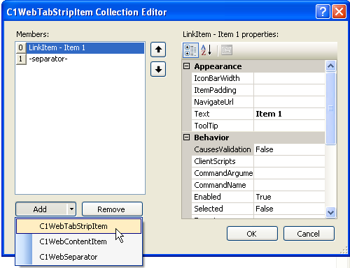
C1WebTabStripItem Properties
The following properties for the Link item type are available for the user in the C1WebTabStripItem Collection Editor:
· C1WebTabStripItem Appearance Properties
The appearance properties change the appearance of the tabstrip item. The appearance properties and their description are listed below:
|
Property |
Description |
|
IconBarWidth |
Sets or returns the width of the icon bar drawn on the side of the groups. |
|
ItemPadding |
Space between item's border and content. |
|
NavigateUrl |
Gets or sets the URL link once the hyperlink is clicked in the toolbar item. |
|
Text |
Gets or sets the text displayed for the item in the control. |
|
ToolTip |
Gets or sets the ToolTip text displayed when the mouse pointer rests over the item. |
· C1WebTabStripItem Behavior Properties
The behavior properties change the item's behavior. The behavior properties and their description are listed below:
|
Property |
Description |
|
CausesValidation |
Determines whether validation is performed when the item is clicked. |
|
ClientScripts |
Collection of client-side scripts associated with the item. |
|
CommandArgument |
Gets or sets an optional parameter passed to the ItemClick and ItemSelected events of the C1WebToolBar component along with the associated CommandName. |
|
CommandName |
Gets or sets the command name associated with the C1WebToolBarItem passed to the ItemClick and ItemSelected events of the C1WebToolBar component. |
|
DropDownContextMenuId |
Specifies the ID of the linked C1WebMenu in Custom context mode for the drop-down button. |
|
Enabled |
Gets or sets a value indicating whether the item is enabled. |
|
Selected |
Gets or sets a value indicating whether the current item is selected. |
|
Target |
Gets or sets the target window or frame to display the Web page content linked to when the C1WebLinkItem is clicked. |
|
Visible |
Gets or sets a value indicating whether or not the item is visible. |
|
WrapText |
Gets or sets a value that indicates whether the item's text is wrapped. |
|
KeyboardShortcut |
String representing keyboard shortcut to perform the action of this item. |
· C1WebTabStripItem Style Properties
The style properties change the item's style. The style properties and their description are listed below:
|
Property |
Description |
|
DisabledItemStyle |
Style for the item in disabled state. |
|
ItemStyle |
Style for the item. |
|
MouseOverItemStyle |
Style for the item when the mouse hovers over it. |
|
MouseOverSelectedItemStyle |
Style for the item when the mouse hovers over the selected item. |
|
SelectedItemStyle |
Default style for the child items in the selected state. |
C1WebContentItem Properties
When a Content item is selected in the tree view of the C1WebTabStripItem Collection Editor, it contains the following types of properties:
· C1WebContentItem Appearance properties
The C1WebContentItem Appearance properties specify the appearance for the C1WebTabStrip content items. The content item's appearance property and its description is listed below:
|
Property |
Description |
|
ItemPadding |
Space between the item's border and content. |
· C1WebContentItem Style properties
The C1WebContentItem Style properties specify the style for the C1WebTabStrip content items. The Content Items' style properties and their description are listed below:
|
Property |
Description |
|
BackColor |
Background color of the controls applied with this style. |
|
BackImageUrl |
The URL of the background image. |
|
BorderColor |
Border color of the controls applied with this style. |
|
BorderStyle |
Style of the border of controls applied with this style. |
|
BorderWidth |
Thickness of the border around the controls applied with this style. |
|
CssClass |
CSS class name applied to the user of this style. |
|
Font |
The font used for text in the controls applied with this style. |
|
ForeColor |
The foreground color of the controls applied with this style. |
|
Height |
The height of the controls applied with this style. |
|
ImageTextSpacing |
Specifies the spacing between the item's image and text. |
|
ImageUrl |
The URL of the image to use in an icon place. |
|
ItemImagePosition |
Specifies the position of an image relative to the item's text. |
|
LeftBorderImageUrl |
The URL of the left border image. |
|
RightBorderImageUrl |
The URL of the right border image. |
|
Width |
The width of the controls applied with this style. |
C1WebSeparator Properties
The following properties for the C1WebSeparator item type are available for the user in the C1WebTabStripItem Collection Editor:
· C1WebSeparator Style Properties
The style properties change the separator items' style. The C1WebSeparator style properties and their description are listed below:
|
Property |
Description |
|
BackColor |
Background color of the controls applied with this style. |
|
BackImageSize |
Height for horizontal or width for vertical separators. |
|
BackImageUrl |
Image url for the separator image. |
|
BorderColor |
Border color of the controls applied with this style. |
|
BorderStyle |
Style of the border of controls applied with this style. |
|
BorderWidth |
Thickness of the border around the controls applied with this style. |
|
CssClass |
CSS class name applied to the user of this style. |
|
PaddingBottom |
Bottom padding for the separator image. |
|
PaddingLeft |
Left padding for the separator image. |
|
PaddingRight |
Right padding for the separator image. |
|
PaddingTop |
Top padding for the separator image. |
Send comments about this topic to ComponentOne. Copyright © ComponentOne LLC. All rights reserved. |