


 Show All
 Hide All
In section reports, you can use the CrossSectionLine and CrossSectionBox report controls to display a frame, borders, and vertical lines that run from a header section through its related footer section, spanning all details that come between. You can specify line appearance using properties on the report controls, and even round the corners of the CrossSectionBox.
You can only place the cross section controls in header sections in the designer. They automatically span intervening sections to end in the related footer section. (You can also place them in footer sections, but they automatically associate themselves with the related header section in the Report Explorer.)
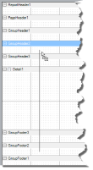


The CrossSectionLine control draws a vertical line from a header section to the corresponding footer section. At runtime, this vertical line stretches through any intervening sections. You can change the appearance of CrossSectionLine by changing the following properties.
| Property | Description |
|---|---|
| LineColor | Allows you to get or set color of the line. |
| LineStyle | Allows you to select the line style from solid, dash or dotted. |
| LineWeight | Allows you to specify the thickness of the line in pixel units. |
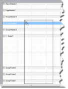
The CrossSectionBox control draws a rectangle from a header section to its corresponding footer section. To change the appearance of the rectangle, you can use the following properties in addition to the ones mentioned above.
| Property | Description |
|---|---|
| Radius | Sets the radius of each corner in pixel units. |
| BackColor | Sets the back color. |
 |
Note: At run time, the BackColor property renders first and the LineColor property renders last. |
 |
Caution: The CrossSectionBox and CrossSectionLine controls do not render properly in multi-column reports, that is, those in which a GroupHeader section has the ColumnLayout property set to True. |
CrossSectionLine Dialog
With the control selected on the report, in the Commands section at the bottom of the Properties window, you can click the Property dialog command to open the dialog.
Name: Enter a name for the control that is unique within the report. This name is displayed in the Document Outline and in XML exports.
Tag: Enter a string that you want to persist with the control. If you access this property in code, it is an object, but in the Properties window or Property dialog, it is a string.
Visible: Clear this check box to hide the control.
Line style: Select a line style to use for the control. You can set it to Transparent, Solid, Dash, Dot, DashDot, or DashDotDot.
Line weight: Enter the width in pixels for the line.
Line color: Select a color to use for the line.
CrossSectionBox Dialog
With the control selected on the report, in the Commands section at the bottom of the Properties window, you can click the Property dialog command to open the dialog.
Name: Enter a name for the control that is unique within the report. This name is displayed in the Document Outline and in XML exports.
Tag: Enter a string that you want to persist with the control. If you access this property in code, it is an object, but in the Properties window or Property dialog, it is a string.
Visible: Clear this check box to hide the control.
Line style: Select a line style to use for the border line. You can set it to Transparent, Solid, Dash, Dot, DashDot, or DashDotDot.
Line weight: Enter the width in pixels for the border line.
Line color: Select a color to use for the border line.
Background color: Select a color to use for the background of the picture control.
Radius: Enter the number of pixels for the amount of rounding to use on the corners of the box. Valid values are from 0 to 1000 pixels.