In the last step, you created a visual style project based on the for the C1ToolBar control using the pre-existing VistaBlack visual style as a base for your project. In this step, you will modify the style and width of the border that surrounds the C1ToolBar control when the control is in a vertical orientation.
Complete the following steps:
1. Under Custom VisualStyles, expand the TutorialStyle node to reveal the C1ToolBar node.
2. In the treeview, select C1ToolBar.
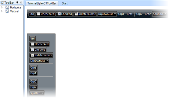
C1ToolBar's elements appear in the control pane and a preview of its visual style appears in the design pane.

3. Expand the Orientation node.
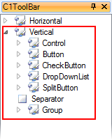
4. Expand the
Vertical node to reveal the elements that comprise a vertically oriented
C1ToolBar control.

You are choosing Vertical because this tutorial only calls for you to modify the style that is applied to a vertical C1ToolBar control. If you wanted to modify the style of a horizontal C1ToolBar instead, you’d just select Horizontal and then complete the same steps.
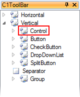
5. In the treeview, select the Control node.

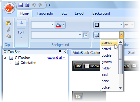
6. Under the Home tab and in the Border group, click the border-style drop-down arrow and select Dashed from the list.

7. In the border-width text box, enter "4".

Note: Make sure that px is selected in the drop-down list.
Step 2 of 4 Completed 
In this step, you modified the border style and width for a vertical C1ToolBar. In the next step, you will modify the C1ToolBar control’s background color and border color.
|
