To implement the header-based filters, the C1FlexGrid control follows the same pattern used to implement column moving and sizing. The grid has a new AllowFiltering property that controls filtering at a control level, and the grid's Column object also has an AllowFiltering property that controls filtering at the column level.
To enable simple filtering scenarios, users simply set the grid's AllowFiltering property to True. They can then disable or customize the filtering behavior for specific columns by changing the value of the column's AllowFiltering property. The column's AllowFiltering property may be set to one of the following values:
- Default: The grid automatically creates a filter of type ColumnFilter. This filter combines a ValueFilter and a ConditionFilter, both described below.
- ByValue: The grid automatically creates a filter of type ValueFilter. This filter contains a list of values that should be displayed. Any values not present on the list are hidden from the end user.
- ByCondition: The grid automatically creates a filter of type ConditionFilter. This filter specifies two conditions such as "greater than" or "contains". The conditions may be combined with an AND or an OR operator.
- Custom: The grid does not create a filter automatically. The developer is expected to instantiate a filter and explicitly assign it to the column's Filter property.
- None: The column cannot be filtered.
By default, the C1FlexGrid control localizes the column filter editor to use the language specified by the CurrentUICulture setting. However, you can use the Language property to override the default and specify the language that should be used when the grid displays the column filter editor.
Value Filter
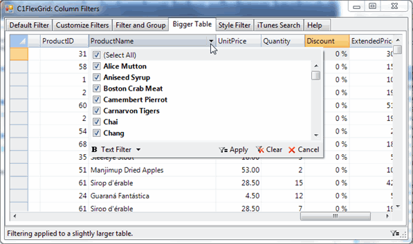
The ValueFilter is conceptually very simple. It contains a list of values, and only the values listed are displayed on the grid. If the list is set to null, the filter is de-activated and all values are displayed. This type of filter is recommended for filtering columns that contain discrete values such as names or enumerations.
The ValueFilter editor consists of a list of values with checkboxes. Users may check or uncheck all values at once. Navigating long lists is easy with the advanced built-in keyboard navigation. The editor implements a flexible search buffer that allows users to locate values by typing any part of the value. For example, typing "Hilton" will select the next value that contains "Hilton", including "New York Hilton", "Prince Edward Hilton", or "Paris Hilton". Also, typing ctrl+Up or ctrl+Down will navigate to the next or previous checked item.
Values are displayed on the list using the Format currently assigned to the column.
 |
Note: When you set filters on more than one column of the grid, the ValueFilter editor only displays the values available for filtering after the previous filters are set. |
This image shows the ValueFilter editor.
Condition Filter
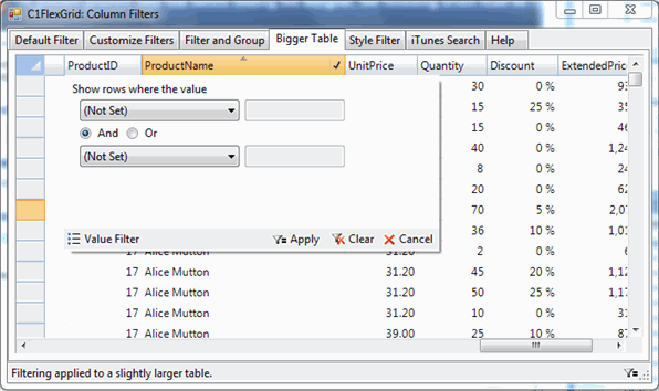
The ConditionFilter is more flexible. Instead of selecting specific values, it allows users to specify up to two conditions using operators such as "greater than", "starts with", or "contains". This type of filter is recommended for filtering columns that contain "continuous" values such as numeric or date/time values.
This image shows the ConditionFilter editor.
Columns that have filters applied display the filter icon on their headers even when the mouse is not over them. You can see this in the images, where the ProductName and Quantity column headers show the filter icon.
The built-in filters support automatic localization in the following languages: English, Spanish, French, Italian, Portuguese, German, Dutch, Russian, Japanese, Greek, Danish, Finnish, Norwegian, Swedish, Arabic, Polish, Chinese (Traditional: Tawain, Hong Kong, Macao; Simplified: PRC, Singapore), Turkish, Persian (Farsi), Korean, and Hebrew. The localization is built-in and does not require satellite dlls.
Custom Filters
Custom filters may be created to handle specialized values. For example, custom filters would be recommended to filter on colors, geographic, or custom data types.
To create a custom filter, the developer must create two classes:
- Filter: This class must implement the IC1ColumnFilter interface, which specifies methods used to apply the filter to a specific value, to reset the filter, and to return an editor to be used for viewing and editing the filter's parameters.
- Filter Editor: This class must inherit from Control and must implement the IC1ColumnFilterEditor interface, which specifies methods used to initialize the editor and to apply changes to the filter.
The CustomFilters sample contains implementations of three custom filters used for filtering values of type Color, DateTime, and string.