A C1SegmentedButtons control is series of buttons along a strip. The buttons are divided on the strip by a thin separator bar, providing the illusion that each button is a piece of the larger strip. Each button on this strip is a separate object represented by the C1SegmentedButton class.
You can add images to the individual tabs by setting the ImageUrl property. You can also set the SelectedImageUrl and the DisabledImageUrl properties to an image. To adjust an image's positioning, you can set the ImagePaddingTop, ImagePaddingLeft, and ImagePaddingRight properties.
You can use C1SegmentedButtons to provide tabbed navigation to the C1MultiView control by setting its MultiViewID property to your C1MultiView's ID. The C1SegmentedButtons control also has an OnClientSelectedIndexChanged event, so you can easily write a client-side script to determine the actions a button will perform. See Using C1SegmentedButtons to Toggle Between States.
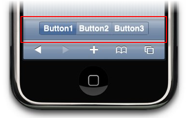
In the image below, a C1SegmentedButtons control with three tabs rests on the toolbar of a C1ViewPort control.
The following markup was used to create the three buttons in the above image:
<cc1:C1ViewPort ID="C1ViewPort1" runat="server">
<ToolBar>
<cc2:C1SegmentedButtons ID="C1SegmentedButtons1" runat="server">
<Buttons>
<cc2:C1SegmentedButton ID="C1SegmentedButton1" Text="Button1" runat="server" />
<cc2:C1SegmentedButton ID="C1SegmentedButton2" Text="Button2" runat="server" />
<cc2:C1SegmentedButton ID="C1SegmentedButton3" Text="Button3" runat="server" />
</Buttons>
</cc2:C1SegmentedButtons>
</ToolBar>
</cc1:C1ViewPort>
For task-based help on the C1SegmentedButtons control, see Using the C1SegmentedButtons Control.