The C1ViewPort control's navigation bar can hold either a title bar or a series of segmented buttons; you can determine which type is used by setting the NavigationBarType property to either TitleBar or SegmentedButtons. If you prefer neither type, you can use the NavigationBarTemplate to create a custom navigation bar.
TitleBar
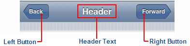
By default, the C1ViewPort control's navigation bar appears as a title bar. In this state, the navigation bar of a C1ViewPort control can hold a left button, a right button, and header text. The diagram below illustrates the different elements of the navigation bar:
The left button of the control is commonly used as a back button. The visibility of the left button is determined by the LeftButtonVisibility property; the default of the LeftButtonVisibility property is auto, which means that the button will only be visible if the Text property is not empty and httpReferer is not null. For task-based help regarding adding a back button to the C1ViewPort control's navigation bar, see Adding a Back Button to the Navigation Bar.
The right button of the control is commonly used as a forward button. The forward button will only appear if one of the navigation items on the page links to another set of navigation list items. To learn how to add a forward button to the C1ViewPort control, see Adding a Forward Button to the Navigation Bar.
The left button and right button share several characteristics. For example, the maximum width of both the left button and the right button is 65 pixels. And if the text of either button is exceeds the 65 pixel limit, the text will render with elliptical points.
The header text, which you can set using the C1ViewPort.Text property, will always appear in the center of the navigation bar. If you add long text to the header, it will render with an ellipsis. To learn how to set the header text, see Adding a Header to the Navigation Bar.
SegmentedButtons
The C1ViewPort control's navigation bar can be switched from a title bar to a segmented buttons bar by setting the NavigationBarType property to SegmentedButtons and then adding the markup for the segmented buttons in Source view. For task-based help about adding segmented buttons to the navigation bar, see Adding Segmented Buttons to the Navigation Bar.
NavigationBarTemplate
To customize the navigation bar, place <NavigationBarTemplate> </NavigationBarTemplate> between the <cc1:C1ViewPort> and </cc1:C1ViewPort> tags. Then, you can add content, such as arbitrary controls and text, to the navigation bar. For task-based help about adding custom elements to the navigation bar, see Adding Custom Elements to the Navigation Bar.