To create a custom visual style based on the Arctic visual style, complete the following:
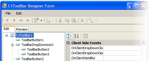
1. Add the C1ToolBar control to your page and select Edit ToolBar to open the C1ToolBar Designer Form.
2. Add a C1ToolBarButton, C1ToolBarDropDownList with two C1ToolBarButtons, and add another C1ToolBarButton. For more information on using the designer see C1ToolBar Designer Form.
The C1ToolBar items should appear like the following in your designer:
3. Copy the theme folder C:\Program Files\ComponentOne Studio for ASP.NET \C1.Web.UI\VisualStyles\ArcticFox\C1ToolBar to a new folder in your Visual Studio project. ~/VisualStyles/ArcticFoxNew/C1ToolBar.
4. Open the styles.css file inside the new folder and replace all instances of _ArcticFox with _ArcticFoxNew. so they end with the new visual style name “ArcticFoxNew”.
Suppose the original class name is .C1ToolBar_ArcticFox, then rename it to .C1ToolBar_ArcticFoxNew.
5. Save the modified .css file.
Note: Make sure the read-only attribute is unchecked for the styles.css file.
6. Save and close your Visual Studio project.
7. Reopen your Visual Studio project.
8. Set the VisualStylePath property to ~/VisualStyles.
9. Set the VisualStyle to the new external custom theme, ArcticFoxNew.
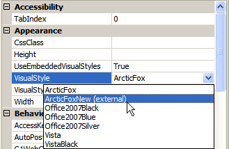
10. Set UseEmbeddedVisualStyles property to False.
11. Now you can open the new styles.css file and edit the correspondent CSS classes. In this example, we change the font color and font weight for the normal toolbar items’ text.
12. Open the new styles.css file and locate the selector name, .C1ToolBar_ArcticFoxNew .C1tbTextNode for the text in the toolbar item types. Add the following values to the color and font-weight:
.C1ToolBar_ArcticFoxNew .C1tbTextNode
{
font-size: 11px;
text-align: center;
color: #FFFFCC;
font-weight: bold;
}
13. Locate the selector name, .C1ToolBar_ArcticFoxNew .C1tbNestedList .C1tbListItem-Hover .C1tbTextNode and add the following value to the Color property to change the hover state for the toolbar items text in a nested list:
.C1ToolBar_ArcticFoxNew .C1tbNestedList .C1tbListItem-Hover .C1tbTextNode
{
color: #FFFFCC;
}
14. Locate the selector name, .C1ToolBar_ArcticFoxNew .C1tbContainer and change the value of the Background property for the following CSS selectors:
.C1ToolBar_ArcticFoxNew .C1tbContainer
{
padding-left: 5px;
margin: 0;
background: #990033;
}
.C1ToolBar_ArcticFoxNew .C1tbOuter
{
padding-top: 5px;
background: #990033;
}
.C1ToolBar_ArcticFoxNew .C1tbInner
{
padding-left: 5px;
margin-left: -5px;
background: #990033;
}
.C1ToolBar_ArcticFoxNew .C1tbContent
{
padding: 0 5px 5px 0;
background: #990033;
}
15. Add the following value to the Background property to change the hover background color for the toolbar items. Find the comment that says, “NON GROUP ITEM HOVER” and change the Background color property for the following CSS selectors:
.C1ToolBar_ArcticFoxNew .C1tbListItem-Hover .C1tbContainer,
.C1ToolBar_ArcticFoxNew .C1tbListItem-Focus .C1tbContainer
{
background: #FF9933;
}
.C1ToolBar_ArcticFoxNew .C1tbListItem-Hover .C1tbOuter,
.C1ToolBar_ArcticFoxNew .C1tbListItem-Focus .C1tbOuter
{
background: #FF9933;
}
.C1ToolBar_ArcticFoxNew .C1tbListItem-Hover .C1tbInner,
.C1ToolBar_ArcticFoxNew .C1tbListItem-Focus .C1tbInner
{
background: #FF9933;
}
.C1ToolBar_ArcticFoxNew .C1tbListItem-Hover .C1tbContent,
.C1ToolBar_ArcticFoxNew .C1tbListItem-Focus .C1tbContent
{
background: #FF9933;
}
16. Locate the selector name, .C1ToolBar_ArcticFoxNew .C1tbListItem .C1tbNestedList .C1tbListItem-Focus, and add the following value to the Background property to change the Background color for the dropdownlist items hover-state:
.C1ToolBar_ArcticFoxNew .C1tbListItem .C1tbDropDown-NestedList .C1tbListItem-Hover,
.C1ToolBar_ArcticFoxNew .C1tbListItem .C1tbNestedList .C1tbListItem-Focus
{
cursor: pointer;
text-decoration: none;
background: #FF9933;
border: solid 1px #d7d0b3;
}
 This Topic Illustrates the Following:
In this topic, you learned how to create a custom visual style. When you build the project, notice the following cosmetic changes:
• The text color is changed to white and it is bolded.
• The hover-text color is changed to white.
• The back color is changed.
• The hover-background color is changed.
• The hover background color for the nested dropdown list items is changed.
The result of this task will resemble the following image:
|