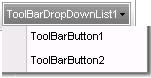
The C1ToolBarDropDownList object defines a drop-down button. A drop-down button provides users with a list of options. A drop-down button can be shown with or without the arrow. To show a drop-down button without an arrow, When you click on a C1ToolBarDropDownList button the Click event always fires and the drop down list appears. The C1ToolBarDropDownList button does not have a vertical line dividing the image from the drop down arrows.
The C1DropDownList element can have the following states:
• Selected
• Selected-hover
• Hover
• Focus
Each state can be styled through its CSS selector. For more information on styling each item state, see C1ToolBar DropDownList Styles.
These include the following for the C1ToolBarSplitButton element: .c1tbSplitButton-selected, .c1tbSplitButton-Selected-Hover, .c1tbSplitButton-Hover, and .c1tbSplitButton-Focus.
The C1ToolBarDropDownList includes the following unique property:
|
Property |
Definition |
|
Gets or sets a value indicating whether an arrow is displayed on the C1ToolBarDropDownList item, which indicates that further options are available in a drop-down list. |
|