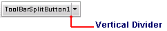
The C1ToolBarSplitButton object defines a split toolbar button. The toolbar split button includes a list of toolbar items like the toolbar drop-down list button, but its toolbar items in the dropdown list appear only when you click the drop-down side of the split button. The Click event doesn’t fire for the toolbar split button type. A solid vertical line dividing the image from the drop down arrow appears when you hover the cursor over the button like in the following image:
Each state can be styled through its CSS selector. For more information on styling each item state, see C1ToolBar Split Button Styles.
The C1ToolBarSplitButton includes the following unique properties:
|
Property |
Definition |
|
The index of the button which properties will be used by default when the EnabledDefaultButton property is set to true. | |
|
Gets or sets a value, indicating if the C1ToolBarSplitButton will use the DefaultButton behavior. |
|