In the previous steps you worked in Visual Studio and Microsoft Expression Blend to create a new project and bind the Grid for WPF to a database. In this step you'll continue in Blend to customize the grid application's appearance. Your project should already be opened in Blend. You can customize the project using XAML or by using the C1DataGrid Properties window to change properties.
To customize Grid for WPF in Blend using XAML, complete the following steps:
1. Change the NewRowPlacement property to FirstItem so that new rows are added to the first line of the grid by adding NewRowPlacement="FirstItem" to the <c1grid:C1DataGrid> tag so that it looks like the following:
<c1grid:C1DataGrid Name="C1DataGrid1" ItemsSource="{Binding Path=ProductsDataSet.Products, ElementName=window, Mode=Default}" NewRowPlacement="FirstItem">
2. Change the Theme property from the Office2007Default theme to the MediaPlayer theme by adding Theme="{DynamicResource {c1grid:C1ThemeKey ThemeName=MediaPlayer, TypeInTargetAssembly={x:Type c1grid:C1DataGrid}}}" to the <c1grid:C1DataGrid> tag so that it looks like the following:
<c1grid:C1DataGrid Name="C1DataGrid1" ItemsSource="{Binding Path=ProductsDataSet.Products, ElementName=window, Mode=Default}"NewRowPlacement="FirstItem" Theme="{DynamicResource {c1grid:C1ThemeKey ThemeName=MediaPlayer, TypeInTargetAssembly={x:Type c1grid:C1DataGrid}}}">
3. Set the AutoGenerateColumns property to False by adding AutoGenerateColumns="False" to the <c1grid:C1DataGrid> tag so that it looks like the following:
<c1grid:C1DataGrid Name="C1DataGrid1" ItemsSource="{Binding Path=ProductsDataSet.Products, ElementName=window, Mode=Default}"NewRowPlacement="FirstItem" Theme="{DynamicResource {c1grid:C1ThemeKey ThemeName=MediaPlayer, TypeInTargetAssembly={x:Type c1grid:C1DataGrid}}}" AutoGenerateColumns="False">
Because you'll customize which columns will appear in the grid, you don't want the columns to be automatically generated.
4. Add XAML (the <c1grid:C1DataGrid.Columns> tags) to the <c1grid:C1DataGrid> tags so that it looks like the following:
<c1grid:C1DataGrid Name="C1DataGrid1" ItemsSource="{Binding Path=ProductsDataSet.Products, ElementName=window, Mode=Default}" NewRowPlacement="FirstItem" Theme="{DynamicResource {c1grid:C1ThemeKey ThemeName=MediaPlayer, TypeInTargetAssembly={x:Type c1grid:C1DataGrid}}}" AutoGenerateColumns="False">
<c1grid:C1DataGrid.Columns>
<c1grid:Column PropertyName="ProductName" Caption="Name" HeaderCellWidth="150"/>
<c1grid:Column PropertyName="QuantityPerUnit" Caption="Unit Size" HeaderCellWidth="125"/>
<c1grid:Column PropertyName="UnitPrice" Caption="Price" HeaderCellWidth="60"/>
<c1grid:Column PropertyName="UnitsInStock" Caption="In Stock" HeaderCellWidth="75"/>
<c1grid:Column PropertyName="UnitsOnOrder" Caption="On Order" HeaderCellWidth="80"/>
<c1grid:Column PropertyName="ReorderLevel" Caption="Reorder Level" HeaderCellWidth="100"/>
<c1grid:Column PropertyName="Discontinued" Caption="Discontinued" HeaderCellWidth="95"/>
<c1grid:Column PropertyName="ProductsOrder Details" Caption="Ordered Products"/>
</c1grid:C1DataGrid.Columns>
</c1grid:C1DataGrid>
Only the columns specified above will appear in your grid now. Notice that the column tags specify the PropertyName, the Caption, and the HeaderCellWidth. The ProductsOrder Details column is an expandable child list that details order information from the Order_Details table.
To customize Grid for WPF in Blend using the Properties window, complete the following steps:
1. In the Properties window, locate the NewRowPlacement property in the Data tab and change its value to FirstItem so that new rows are added to the first line of the grid:

The XAML will now look similar to the following:
<c1grid:C1DataGrid Name="C1DataGrid1" ItemsSource="{Binding Path=ProductsDataSet.Products, ElementName=window, Mode=Default}" NewRowPlacement="FirstItem">
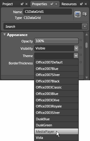
2. In the Properties window, locate the Theme property in the Appearance tab and change its value to MediaPlayer:

This will change the grid's theme from the default Office2007Default theme to the MediaPlayer theme. The XAML will now look similar to the following:
<c1grid:C1DataGrid Name="C1DataGrid1" ItemsSource="{Binding Path=ProductsDataSet.Products, ElementName=window, Mode=Default}"NewRowPlacement="FirstItem" Theme="{DynamicResource {c1grid:C1ThemeKey ThemeName=MediaPlayer, TypeInTargetAssembly={x:Type c1grid:C1DataGrid}}}">
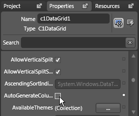
3. Set the AutoGenerateColumns property to False by unchecking the box next to the AutoGenerateColumns property:

Because you'll customize which columns will appear in the grid, you don't want the columns to be automatically generated.
The XAML will now look similar to the following:
<c1grid:C1DataGrid Name="C1DataGrid1" ItemsSource="{Binding Path=ProductsDataSet.Products, ElementName=window, Mode=Default}"NewRowPlacement="FirstItem" Theme="{DynamicResource {c1grid:C1ThemeKey ThemeName=MediaPlayer, TypeInTargetAssembly={x:Type c1grid:C1DataGrid}}}" AutoGenerateColumns="False">
4. Next you'll add columns to the grid using the Column object. You'll specify which columns you want to appear in your grid.
a. Click the ellipsis button next to the Column item.

This will open the Column Collection Editor dialog box.
b. In the Column Collection Editor dialog box, click the Add another item button eight times to add eight columns (numbered 0 to 7) to the collection.

c. Select each column on the left side of the Column Collection Editor dialog box and change each column's properties on the right side of the dialog box, as follows:
|
Column |
Property |
Setting |
|
[0] Column |
PropertyName |
ProductName |
|
|
Caption |
Name |
|
|
HeaderCellWidth |
150 |
|
[1] Column |
PropertyName |
QuantityPerUnit |
|
|
Caption |
Unit Size |
|
|
HeaderCellWidth |
125 |
|
[2] Column |
PropertyName |
UnitPrice |
|
|
Caption |
Price |
|
|
HeaderCellWidth |
60 |
|
[3] Column |
PropertyName |
UnitsInStock |
|
|
Caption |
In Stock |
|
|
HeaderCellWidth |
75 |
|
[4] Column |
PropertyName |
UnitsOnOrder |
|
|
Caption |
On Order |
|
|
HeaderCellWidth |
80 |
|
[5] Column |
PropertyName |
ReorderLevel |
|
|
Caption |
Reorder Level |
|
|
HeaderCellWidth |
100 |
|
[6] Column |
PropertyName |
Discontinued |
|
|
Caption |
Discontinued |
|
|
HeaderCellWidth |
95 |
|
[7] Column |
PropertyName |
ProductsOrder Details |
|
|
Caption |
Ordered Products |
d. Click OK to close the Column Collection Editor dialog box.
The XAML will now look similar to the following:
<c1grid:C1DataGrid Name="C1DataGrid1" ItemsSource="{Binding Path=ProductsDataSet.Products, ElementName=window, Mode=Default}" NewRowPlacement="FirstItem" Theme="{DynamicResource {c1grid:C1ThemeKey ThemeName=MediaPlayer, TypeInTargetAssembly={x:Type c1grid:C1DataGrid}}}" AutoGenerateColumns="False">
<c1grid:C1DataGrid.Columns>
<c1grid:Column PropertyName="ProductName" Caption="Name" HeaderCellWidth="150"/>
<c1grid:Column PropertyName="QuantityPerUnit" Caption="Unit Size" HeaderCellWidth="125"/>
<c1grid:Column PropertyName="UnitPrice" Caption="Price" HeaderCellWidth="60"/>
<c1grid:Column PropertyName="UnitsInStock" Caption="In Stock" HeaderCellWidth="75"/>
<c1grid:Column PropertyName="UnitsOnOrder" Caption="On Order" HeaderCellWidth="80"/>
<c1grid:Column PropertyName="ReorderLevel" Caption="Reorder Level" HeaderCellWidth="100"/>
<c1grid:Column PropertyName="Discontinued" Caption="Discontinued" HeaderCellWidth="95"/>
<c1grid:Column PropertyName="ProductsOrder Details" Caption="Ordered Products"/>
</c1grid:C1DataGrid.Columns>
</c1grid:C1DataGrid>
Only the columns specified above will appear in your grid now. Notice that the column tags specify the PropertyName, the Caption, and the HeaderCellWidth. The ProductsOrder Details column is an expandable child list that details order information from the Order_Details table.
Run the program and observe:
You've changed the appearance of the grid and the columns that are displayed:

You've successfully customized the appearance and behavior of your grid. In the next step you'll explore some of the run-time interactions that are possible in your grid application.
|
