ComponentOne Grid for WPF incorporates various data views that allow you to customize the appearance of your grid. These views include a tabular view with vertical row distribution (the default view), a tabular view with horizontal row distribution, a card view, and a carousel view. In addition you can create your own custom views. Each built-in view is pictured and described below.
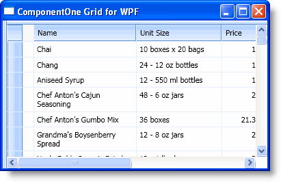
Vertical Tabular Grid
This is the default data view and it appears like a traditional grid with headers at the top of the grid and rows and columns of content below the header.
In XAML
To specifically define the tabular view with vertical row distribution in your grid, add the following Style XAML to the <c1grid:C1DataGrid> tag so that it appears similar to the following:
<c1grid:C1DataGrid Name="C1DataGrid1" ItemsSource="{Binding Path=GridDataSet.Products, ElementName=Window1, Mode=Default}" Style="{StaticResource {ComponentResourceKey ResourceId=TabularVerticalViewStyle, TypeInTargetAssembly={x:Type c1grid:C1DataGrid}}}">
In Code
To specifically define the tabular view with vertical row distribution in your grid, add the following code your project:
C1DataGrid1.Style = TryCast(C1DataGrid1.FindResource(New ComponentResourceKey(GetType(C1DataGrid), "TabularVerticalViewStyle")), Style)
• C#
c1DataGrid1.Style = c1DataGrid1.FindResource(new ComponentResourceKey(typeof(C1DataGrid), "TabularVerticalViewStyle")) as Style;
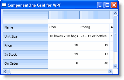
Horizontal Tabular Grid
This view is similar to the tabular view with vertical row distribution, but in this case the grid is organized horizontally with the headers to the left and content to the right of the grid.
In XAML
To specify the tabular view with horizontal row distribution in your grid, add the following Style XAML to the <c1grid:C1DataGrid> tag so that it appears similar to the following:
<c1grid:C1DataGrid Name="C1DataGrid1" ItemsSource="{Binding Path=GridDataSet.Products, ElementName=Window1, Mode=Default}" Style="{StaticResource {ComponentResourceKey ResourceId=TabularHorizontalViewStyle, TypeInTargetAssembly={x:Type c1grid:C1DataGrid}}}">
In Code
To define the tabular view with horizontal row distribution in your grid, add the following code your project:
C1DataGrid1.Style = TryCast(C1DataGrid1.FindResource(New ComponentResourceKey(GetType(C1DataGrid), "TabularHorizontalViewStyle")), Style)
• C#
c1DataGrid1.Style = c1DataGrid1.FindResource(new ComponentResourceKey(typeof(C1DataGrid), "TabularHorizontalViewStyle")) as Style;
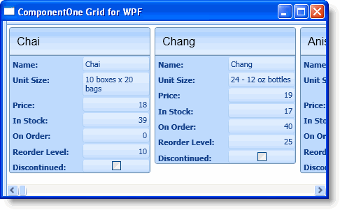
Card View
This is a card view that appears similar to a traditional rolodex or card catalog in which each row appears in its own 'card'.
In XAML
To specify the card view in your grid, add the following Style XAML to the <c1grid:C1DataGrid> tag so that it appears similar to the following:
<c1grid:C1DataGrid Name="C1DataGrid1" ItemsSource="{Binding Path=GridDataSet.Products, ElementName=Window1, Mode=Default}" Style="{StaticResource {ComponentResourceKey ResourceId=CardViewStyle, TypeInTargetAssembly={x:Type c1grid:C1DataGrid}}}">
In Code
To define the card view in your grid, add the following code your project:
C1DataGrid1.Style = TryCast(C1DataGrid1.FindResource(New ComponentResourceKey(GetType(C1DataGrid), "CardViewStyle")), Style)
• C#
c1DataGrid1.Style = c1DataGrid1.FindResource(new ComponentResourceKey(typeof(C1DataGrid), "CardViewStyle")) as Style;
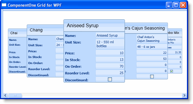
Carousel View
The carousel view is similar to the card view, but each card in this case overlaps and rotates in and out of the main focus at run time though a drag-and-drop operation.
In XAML
To specify the carousel view in your grid, add the following Style XAML to the <c1grid:C1DataGrid> tag so that it appears similar to the following:
<c1grid:C1DataGrid Name="C1DataGrid1" ItemsSource="{Binding Path=GridDataSet.Products, ElementName=Window1, Mode=Default}" Style="{StaticResource {ComponentResourceKey ResourceId=CarouselViewStyle, TypeInTargetAssembly={x:Type c1grid:C1DataGrid}}}">
In Code
To specify the carousel view in your grid, add the following code your project:
C1DataGrid1.Style = TryCast(C1DataGrid1.FindResource(New ComponentResourceKey(GetType(C1DataGrid), "CarouselViewStyle")), Style)
• C#
c1DataGrid1.Style = c1DataGrid1.FindResource(new ComponentResourceKey(typeof(C1DataGrid), "CarouselViewStyle")) as Style;
Custom Views
You can also create your own views, fully customizing user interface elements including customizing item, header, group by area, and cells of the items, and defining an arbitrary item distribution panel, current item, sort indicators, and much more.
|