C1Scheduler provides three supplementary calendar controls: C1MonthCalendar, C1MultiMonthCalendar, and C1DateTimePicker.
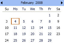
• The C1MonthCalendar control is used to create a one-month calendar user interface, allowing users to select a specific date(s) interactively.
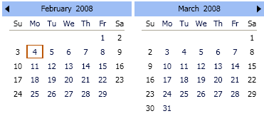
• The C1MultiMonthCalendar control is used to create a calendar, showing multiple months and allowing users to select a specific date (dates) interactively.
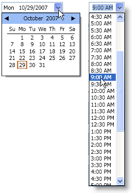
• The C1DateTimePicker control is used in C1Scheduler embedded forms for selecting dates and times from drop-down controls. It can be used for creating a drop-down date or time picker like in the following examples:
All three controls share the same object model.
The purpose of the calendar controls is to provide data that helps to create the calendar user interface (without code, solely in XAML) with an ability to select a specific date interactively. The main properties that express this purpose are:
|
Property |
Description |
|
DateTime DateTime {get; set;} |
Represents a selected date. |
|
int Year {get; set;} |
Defines a year that is represented by a calendar. |
|
int Month {get; set;} |
Defines a month that is represented by a calendar. |
|
DateTime Date {get; set;} |
Represents a date part of the DateTime property. |
|
TimeSpan Time {get; set;} |
Represents a time part of the DateTime property. |
These properties are being kept in synch, so changing the DateTime changes the Year, Month, Date and Time appropriately and vise versa. Other properties include:
|
Property |
Description |
|
CalendarHelper CalendarHelper {get; set;} |
Provides calendar-dependant properties. |
|
int MaxSelectionCount {get; set;} |
Defines the maximum number of days that can be selected in the control. |
|
DateList SelectedDates {get; set;} |
The list of selected dates. |
|
DateList BoldedDates {get; set;} |
The list of bolded dates. |
|
DataTemplate CommandPanelTemplate {get; set;} |
A DataTemplate that defines a UI representation of a calendar command panel. A DataContext for this template is the calendar instance itself. |
|
ItemsPanelTemplate DaysPanel {get; set;} |
An ItemsPanelTemplate that defines the panel that lays out elements representing days of a month. By default the AutoDistributionGrid panel with 7 columns and 6 rows is used. |
|
DataTemplate DaySlotTemplate {get; set;} |
A DataTemplate that defines a UI representation of a single day of a month. A DataContext for this template is a DaySlot object. |
|
Style DaySlotStyle {get; set;} |
A Style for DaySlotPresenter elements which are the root elements of a visual tree representing a single day of a month. |
|
ItemsPanelTemplate DaysOfWeekPanel {get; set;} |
An ItemsPanelTemplate that defines the panel that lays out elements representing days of week. By default the StackPanel with horizontal orientation is used. |
|
DataTemplate DayOfWeekSlotTemplate {get; set;} |
A DataTemplate that defines a UI representation of a single day of week. A DataContext for this template is a DayOfWeekSlot object. |
|
Style DayOfWeekSlotStyle {get; set;} |
A Style for DayOfWeekSlotPresenter elements which are the root elements of a visual tree representing a single day of week. |
|
string MonthFullName { get; } |
Gets a full name of a month currently represented by calendar taking into account current culture. |
|
bool DecrementedDateOnDayBoundary {get; set;} |
Turns on or off a special mode in which the Date property returns a date that is previous to a date specified in the DateTime property in case when DateTime.TimeOfDay is zero. If this property is set to true and TimeOfDay component of the DateTime property value is zero then the Date property value returns a date that is previous to the date specified in the DateTime property. |
|
ResourceDictionaryTheme {get; set;} |
Gets or sets a ResourceDictionary object containing calendar theme resources. |
All controls expose the following RoutedEvent:
|
Event |
Description |
|
Occurs when the DateTime property value has been changed. |
 Binding Schedule to a Calendar Control
|