Silverlight themes are a collection of image settings that define the look of a control or controls. The benefit of using themes is that you can apply the theme across several controls in the application, thus providing consistency without having to repeat styling tasks.
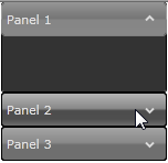
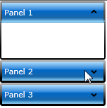
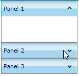
When the C1Accordion control is added to your project, it appears with the default blue theme:
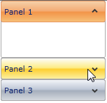
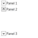
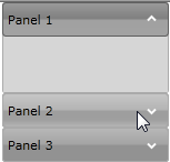
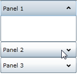
You can also theme the C1Accordion control with one of our seven included Silverlight themes: BureauBlack, Cosmopolitan, ExpressionDark, ExpressionLight, RainierOrange, ShinyBlue, and WhistlerBlue. The table below provides a sample of each theme.
Full Theme Name | Appearance |
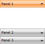
C1ThemeBureauBlack |
|
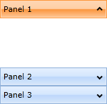
C1ThemeCosmopolitan |
|
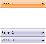
C1ThemeExpressionDark |
|
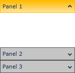
C1ThemeExpressionLight |
|
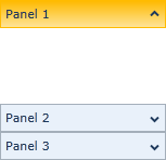
C1ThemeOffice2007Black |
|
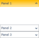
C1ThemeOffice2007Blue |
|
C1ThemeOffice2007Silver |
|
C1ThemeOffice2010Black |
|
C1ThemeOffice2010Blue |
|
C1ThemeOffice2010Silver |
|
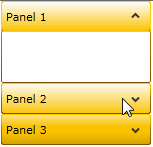
C1ThemeRainierOrange |
|
C1ThemeShinyBlue |
|
C1ThemeWhistlerBlue |
|
You can add any of these themes to a C1Accordion control by declaring the theme around the control in markup and then setting the Theme.Apply mode to Auto. For task-based help about adding themes to the C1Accordion control, see the Using C1Accordion Themes.