 This Topic Illustrates the Following:
The C1Accordion control comes equipped with a light blue default theme, but you can also apply seven themes (see Accordion Theming) to the control. In this topic, you will change the C1Accordion control's theme to C1ThemeRainierOrange in Blend and in Visual Studio.
In Blend
Complete the following steps:
1. Click the Assets tab.
2. In the search bar, enter "C1ThemeRainierOrange".
The C1ThemeRainierOrange icon appears.
3. Double-click the C1ThemeRainierOrange icon to add it to your project.
4. In the search bar, enter "C1Accordion" to search for the C1Accordion control.
5. Double-click the C1Accordion icon to add the C1Accordion control to your project.
6. Under the Objects and Timeline tab, select [C1Accordion] and, using a drag-and-drop operation, place it underneath [C1ThemeRainierOrange].
7. Return to the Assets tab.
8. In the search bar, enter "C1AccordionItem" to search for the C1AccordionItem item.
9. Double-click the C1AccordionItem icon to add it to the C1Accordion control. Repeat this twice so that you have a total of three accordion panes.
10. Under the Objects and Timeline tab, select [C1Accordion] to reveal its list of properties under the Properties panel. Set the following properties:
•Set the Width property to "150".
•Set the Height property to "150".
11. Under the Objects and Timeline tab, select the first [C1AccordionItem] to reveal its list of properties under the Properties panel. Complete the following:
•Set the Width property to "150".
•Check the Margin property and make sure each margin is set to "0".
12. Under the Objects and Timeline tab, select the second[C1AccordionItem] to reveal its list of properties under the Properties panel. Complete the following:
•Set the Width property to "150".
•Check the Margin property and make sure each margin is set to "0".
13. Under the Objects and Timeline tab, select the third [C1AccordionItem] to reveal its list of properties under the Properties panel. Complete the following:
•Set the Width property to "150".
•Check the Margin property and make sure each margin is set to "0".
14. Run the project.
In Visual Studio
Complete the following steps:
1. Open the .xaml page in Visual Studio.
2. Place your cursor between the <Grid></Grid> tags.
3. In the Toolbox, double-click the C1ThemeRainierOrange icon to declare the theme. Its tags will appear as follows:
<c1:C1ThemeRainierOrange></c1:C1ThemeRainierOrange>
4. Place your cursor between the <c1:C1ThemeRainierOrange> and </c1:C1ThemeRainierOrange> tags.
5. In the Toolbox, double-click the C1Accordion icon to add the control to the project. Its tags will appear as children of the <c1:C1ThemeRainierOrange> tags. Any control that appears as a child item of that theme will adopt that theme.
6. Add Height="150" and Width="150" to the <c1:C1Accordion> tags so that the markup resembles the following:
<c1:C1Accordion Height="150" Width="150">
7. To create the accordion items, enter the following markup between the <c1:C1Accordion> and </c1:C1Accordion> tags:
<c1:C1AccordionItem Header="Panel 1"></c1:C1AccordionItem>
<c1:C1AccordionItem Header="Panel 2"></c1:C1AccordionItem>
<c1:C1AccordionItem Header="Panel 3"></c1:C1AccordionItem>
8. Run your project. By placing your control within the <c1:C1ThemeRanierOrange> tags, you have applied the theme to the control.
This Topic Illustrates the Following:
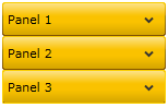
The result of this topic resembles the following image: