You can use the Icon Editor to load an existing icon, edit icons, capture an icon, create a new icon, or save icons. Double click a tool in the Designer tree view or right click and select Edit Bitmap to display the Icon Editor dialog.
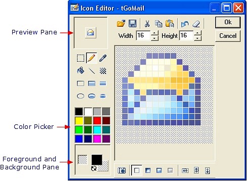
Icon Editor

The Icon Editor preview pane displays a preview of the icon and possesses the following components.
- Open - opens icon and image files for editing.
- Save - saves icon and image files for editing.
- Cut - cuts image in Icon Editor window to clip board.
- Copy - copies image in Icon Editor window to and from clip board.
- Paste - pastes image in Icon Editor window to and from clip board.
- Undo - undo last editing action.
- Clear - clears the current Icon Editor window contents.
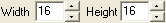
- Width - adjusts the width of the image in pixels.
- Height - adjusts the height of the image in pixels.


- Selection Tool - selects a rectangular area in the Icon Editor window.
- Pen Tool - draws pixels using the current foreground color.
- Eyedropper Tool - picks the color at the specified pixel and selects it as the foreground color.
- Fill Tool - fills a contiguous area with the current selected foreground color.
- Line Tool - draws a line between two points. Holding the Ctrl key while dragging the mouse draws a straight horizontal line. Holding the Alt key while dragging the mouse draws a straight vertical line.
- Pattern Tool - draws a 3x3 pixel pattern using the selected foreground color. Holding the control key switches the pattern from odd pixels to even.
- Bordered Rectangle - draws a rectangular shape with a border of the selected foreground color.
- Bordered Rectangle Filled - draws a rectangular shape filled with the selected background color and has a one-pixel border of the selected foreground color.
- Rectangle Filled - draws a rectangular shape filled with the selected background color.
- Border Circle - draws a circle with a border of the selected foreground color.
- Border Circle Filled - draws a circle filled with the selected background color and a one-pixel border using the selected foreground color.
- Circle Filled - draws a circle filled with the selected background color.
- Color Pallette - Use to select the current foreground color.
- Foreground and Background Pane - displays the current foreground and background colors. Clicking on the
 reverse icon swaps the colors displayed in the
  foreground and background. Selecting either the foreground or background swatch in the Foreground and Background icon displays the Define Color dialog. This dialog allows you to create custom colors for your icons.
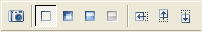
- Icon Capture tool - captures any portion of your screen. When you select the Icon Capture tool, a zoom window appears in the upper left or lower right corner of the screen. The window displays a magnified view of the target area that you select with your mouse.You can adjust the size of the selected target area using the Width and Height controls. Press the ESCAPE key to exit before capturing an image.
- Normal - select this view to design the default icon to display for a tool. ActiveBar can automatically generate the remaining states from this icon.
- Pressed - select this view to design an icon to represent the pressed state of a tool.(optional)
- Mouse-Hover - select this view to design an icon to show when a mouse pointer hovers over a tool.(optional)
- Disabled - select this view to design an icon to represent the disabled state of a tool.
- Left Shift - moves image in Icon Editor window 1 pixel to the left.
- Upward Shift - moves image in Icon Editor window 1 pixel upward.
- Downward Shift - moves image in Icon Editor window 1 pixel downward.
- Right Shift - moves image in Icon Editor window 1 pixel to the right.
| See Also |
Designer Tree View | ActiveBar Designer
Copyright © 2006 Data Dynamics, Ltd. All Rights Reserved.