Creating Button Cells
- Creating a Button Cell and Setting Its Type
- Displaying Text in a Button Cell
- Displaying Pictures in a Button Cell
- Setting the Border Color for Button Cells
- Customizing the Three-Dimensional Appearance of Button Cells
- Setting Background and Text Colors of Button Cells
Overview
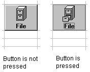
Button cells look and act like rectangular buttons in your sheet, as shown in the following figure.

By default, button cells act like push buttons, which you can press by pressing your left mouse button, and which do not stay pressed when you release your mouse button. If you prefer, button cells can act like toggle, or two-state, buttons, which stay pressed when you click them using your left mouse button. Buttons are false when they are not pressed, and true when they are pressed.
Button cells can display text, pictures, or both. If they display pictures, you can choose that a different picture is displayed when the button is pressed. You can specify the alignment of text and pictures in button cells.

You can customize the colors in button cells, including the color of the border, text, and background. In addition, button cells can display a three-dimensional appearance, and you can customize the colors of the highlight and shadow in the appearance.

For a description of how button cells validate data, see Data Validation.
In summary, you can use the following properties to customize button cells. The italicized properties are unique to this cell type. For more information on remembered properties, refer to Cell Type Settings Remembered.
The following methods can be used to load or save pictures in the cell.


