You can customize the appearance of header cells. These tasks relate to setting the appearance of headers for rows or columns in the sheet:
- Customizing the Default Header Labels
- Customizing Header Label Text
- Customizing the Style of Header Cells
- Adding a Gradient to Header Cells
- Customizing the Header Grid Lines
- Setting the Height or Width of Header Cells
- Creating a Span in a Header
You can also customize header appearance in other ways.
- You can set the starting number for the default header labels.
- If you have multiple rows in the column headers, you can select which row displays the sort indicator and which row displays the automatic text.
- You can show a row selector icon for the selected row (ShowRowSelector).
Header Cell States
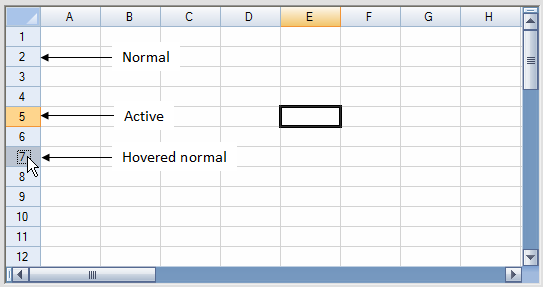
The appearance of the header cell is determined also by the state, whether it is selected (active) or not (normal), as shown in the figure below.

For information on the appearance of the sheet corner, refer to Customizing the Sheet Corner Appearance
For more information on cell-level properties of header cells, refer to the Cell and Cells objects. For more information on the painting of the header cells, refer to the ColumnHeaderRenderer class and RowHeaderRenderer class.


