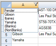
This topic summarizes how the end user interacts with the simple filter feature.
Once you have row filtering applied to a column (as described in Allowing the User to Filter Rows), an indicator appears in the column header. The different appearances of the row filtering indicator are summarized in this table:
| Row Filtering Indicator | Description |
|---|---|
|
|
Appearance of header cell with no row filtering; this occurs when there is no row filtering, or when row filtering is off |
|
|
Appearance of header cell with row filtering allowed but no rows filtered; this occurs when row filtering is set to (All) thus not restricting rows based on the contents of this column |
|
|
Appearance of header cell with row filtering allowed and some rows filter; this occurs when row filtering some of the rows based on the contents of this column |
The column header displays the row filtering indicator, a drop-down arrow symbol. Clicking on this indicator provides a drop-down list of the filter choices. Picking an item from this list causes that filter to be applied and all the rows meeting that condition (in this column) are filtered. The default drop-down list contains all the unique text values in cells in this column. The figure below shows an example of a drop-down list of filters.

| Filter List Item | Description |
|---|---|
| (All) | Include or allow all the rows in this column regardless of content |
| [contents] | Include or allow only those rows with this particular cell content in this column |
| (Blanks) | Include or allow only rows that have blanks (empty cells) in this column |
| (NonBlanks) | Include or allow only rows that have non-blanks (non-empty cells) in this column, in other words any cell that has any content |
You can customize the way this list is displayed, as described in Customizing the Filter List. You can create custom filters to add to the drop-down list, as described in Creating a Completely Custom Filter.
For a given sheet, multiple columns may have filtering set. The different columns may have different filters, depending on the contents of cells in that column. The results of filtering would be similar to what one would expect with primary and secondary keys when sorting data. The choice from the filter list from the initial column would filter some rows, leaving the choices in the subsequent filter list to be a subset of the total possible. By selecting choices from more than one filter, the results include only those rows that satisfy all the selected filtering conditions.
For more information on setting up row filters, refer to Allowing the User to Filter Rows. For more information on setting the appearance of filtered rows, refer to Setting the Appearance of Filtered Rows.
To understand the aspects of filtering that can be customized, return to the overview at Managing Filtering of Rows of User Data.


