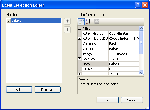
The Label Collection Editor is used for adding or modifying Chart labels on the data series. ChartLabels are used for labeling an important data point on the data series. For more information on using chart labels, see Charting Labels.
To Access the Label Collection Editor
1. Right-click on the C1Chart control and select Properties from its context menu.
2. In the Properties window, expand the ChartLabels node, then click on the ellipsis button next to the LabelsCollection property. The Label Collection Editor opens.

Properties available in the Label Collection
Editor ![]()
The following properties are available for the user in the Label Collection Editor at design time or they can be used in the ChartLabels class at run time:
|
Members |
Description |
|
Gets or sets the label attachment method. | |
|
Gets or sets the fill color. | |
|
Gets or sets the group index of the data point to attach a label when the label AttachMethod property specifies DataIndex attachment. | |
|
Gets or sets the point index of the data point to attach a label when the label AttachMethod property specifies DataIndex attachment. | |
|
Gets or sets the series index of the data point to attach a label when the label AttachMethod property specifies Coordinate or DataCoordinate attachment. | |
|
Gets or sets the X coordinate (data or client) when the label AttachMethod property specifies Coordinate or DataCoordinate attachment. | |
|
Gets or sets the Y coordinate (data or client) when the label AttachMethod property species Coordinate or DataCoordinate attachment. | |
|
Gets or sets the position of the label relative its specified location. | |
|
Gets or sets whether a connecting line is drawn to an associated data point. | |
|
Image |
Gets or sets the image. |
|
Gets the location of the label in chart control client coordinates. | |
|
Gets or sets the label name. | |
|
Gets or sets the offset distance in pixels from an associated data point. | |
|
Gets or sets the size of the label in chart control client coordinates. | |
|
Gets or sets the default size of the label. | |
|
Gets the Style object of the label. | |
|
Gets or sets whether the text is automatically wrapped. | |
|
Gets or sets the background color. | |
|
Gets or sets the gradient or hatch background. | |
|
Gets the border object. | |
|
Gets or sets the border style. | |
|
Border.Color |
Gets or sets the border color. |
|
Gets the Rounding object that controls the rounding of corners. | |
|
Gets or sets the border thickness. | |
|
Gets or sets the font object. | |
|
Gets or sets the foreground color. | |
|
Defines the style of the background gradient filling. | |
|
Defines the style of the background hatch filling. | |
|
Gets or sets the text horizontal alignment. | |
|
Gets or sets the image alignment. | |
|
Gets or sets the opaqueness of the background. | |
|
Gets or sets the text orientation. | |
|
Gets or sets the text vertical alignment. | |
|
Gets or sets the text of the label. | |
|
Gets or sets the tooltip text. | |
|
Gets or sets the label visibility. |
Send comments about this topic to ComponentOne. Copyright © ComponentOne LLC. All rights reserved. |