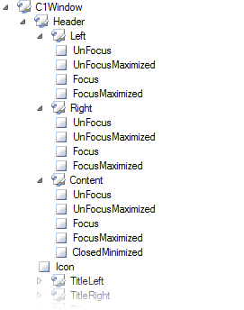
Currently, you can style over twenty Studio for ASP.NET controls using Foxy for ASP.NET (see Available Visual Styles for a complete list). Each control is broken apart into its own unique set of elements. When you open each control in Foxy for ASP.NET, you will see these elements in the treeview of the control pane (see Control Pane). C1Window, for example, begins with a top-level element of C1Window (representing the entire control) which then has four sub-elements: Header, Content, Footer, and Resizer. Those sub-elements are then segmented into smaller elements. For instance, the Header element is broken up into the Left, Right, and Content sub-elements. And it continues. If you expand the Left, Right, and Content sub-elements, you’ll see that they are then dissected into more elements, each of which represents a certain behavior of the control. The image below illustrates these elements:

|
