In this tutorial you'll learn how to create a simple C1WebTabStrip in code. The C1WebTabStrip will include two tab headers and a few link items in each tab.
This tutorial is divided into six lessons. It's is recommended that you follow each lesson sequentially from start to finish. The six lessons in this tutorial include the following:
· Adding a C1WebTabStrip to the PlaceHolder Control
· Adding Styles and GroupStyles to the Tabstrip
· Adding Tab Headers and Items to the Tabstrip
· Adding General Styles to the Active Tab Headers
· Adding General Styles to the Inactive Tab Headers
· Adding Mouseover Styles to the Active and Inactive Tab Headers
Adding a C1WebTabStrip to the PlaceHolder Control
In this first part of the lesson we are going to add a PlaceHolder control to our web form to hold the place of the C1WebTabTabStrip control, and then we are going to programmatically add the C1WebTabStrip to the PlaceHolder control.
1. Create a new web site.
2. Add a reference to the C1.Web.C1Command.2 assemby to your project.
3. Select the Design view.
4. Expand the Standard tab in the toolbox, and then double-click on the PlaceHolder item in the toolbox.
This adds the PlaceHolder control onto the web form. The PlaceHolder control holds the place of the C1WebTabStrip control.
5. Right-click on the Place Holder control and select View Code.
6. Import the C1.Web.Command and the System.Drawing namespaces at the top of the source code page. This prevents you from typing the entire namespace out every time you use C1WebCommand2's objects.
Imports C1.Web.Command
Imports System.Drawing
· C#
using C1.Web.Command;
using System.Drawing;
· Delphi
uses C1.Web.Command;
uses System.Drawing;
7. In the Page_Load procedure enter the following line of code to create an instance of the class.
The variable name for the C1WebTabStrip control is tabstrip.
Dim tabstrip As New C1WebTabStrip()
· C#
C1WebTabStrip tabstrip = new C1WebTabStrip();
· Delphi
var
tabstrip: C1WebTabStrip;
begin
tabstrip := C1WebTabStrip.Create;
8. The next line of code adds the tabstrip control to the PlaceHolder1 control. Add the following code in the Page_Load procedure.
PlaceHolder1.Controls.Add(tabstrip)
· C#
PlaceHolder1.Controls.Add(tabstrip);
· Delphi
PlaceHolder1.Controls.Add(tabstrip);
Adding Styles and GroupStyles to the Tabstrip
You have successfully created a C1WebTabStrip, and are ready to begin programmatically setting the back color and group padding for the C1WebTabStrip as well as applying group styles for the groups we will be adding in the next section.
Add the following code in the Page_Load procedure to add styles to the tabstrip and the GroupStyle object of the tabstrip.
tabstrip.BackColor = Color.LightSkyBlue
tabstrip.GroupPadding = Unit.Pixel(20)
' set the styles for the GroupStyle object
tabstrip.GroupStyle.Height = Unit.Pixel(200)
tabstrip.GroupStyle.Width = Unit.Pixel(300)
tabstrip.GroupStyle.BackColor = Color.LightYellow
tabstrip.GroupStyle.BorderStyle = BorderStyle.Outset
tabstrip.GroupStyle.BorderColor = Color.White
tabstrip.GroupStyle.BorderWidth = Unit.Pixel(1)
· C#
tabstrip.BackColor = Color.LightSkyBlue;
tabstrip.GroupPadding = Unit.Pixel(20);
// set the styles for the GroupStyle object
tabstrip.GroupStyle.Height = Unit.Pixel(200);
tabstrip.GroupStyle.Width = Unit.Pixel(300);
tabstrip.GroupStyle.BackColor = Color.LightYellow;
tabstrip.GroupStyle.BorderStyle = BorderStyle.Outset;
tabstrip.GroupStyle.BorderColor = Color.White;
tabstrip.GroupStyle.BorderWidth = Unit.Pixel(1);
· Delphi
tabstrip.BackColor := Color.LightSkyBlue;
tabstrip.GroupPadding := &Unit.Pixel(20);
tabstrip.GroupStyle.Height := &Unit.Pixel(200);
tabstrip.GroupStyle.Width := &Unit.Pixel(300);
tabstrip.GroupStyle.BackColor := Color.LightYellow;
tabstrip.GroupStyle.BorderStyle := BorderStyle.Outset;
tabstrip.GroupStyle.BorderColor := Color.White;
tabstrip.GroupStyle.BorderWidth := &Unit.Pixel(1);
Adding Tab Headers and Items to the Tabstrip
Now that you have applied the group styles for the C1WebTabStrip, you can add two new tab headers that we will refer to as a Travel and a Maps header. You are going to create two link items for each tab header. You are also going to assign URL's to each link item.
1. Add two groups/tab headers to the tabstrip. The following line of code creates a new C1WebTabStripGroup for each tab header and adds it to the tabstrip control. Add the following code in the page load procedure.
tabstrip.Groups.Add(New C1WebTabStripGroup("Travel"))
tabstrip.Groups.Add(New C1WebTabStripGroup("Maps"))
· C#
tabstrip.Groups.Add(new C1WebTabStripGroup("Travel"));
tabstrip.Groups.Add(new C1WebTabStripGroup("Maps"));
· Delphi
tabstrip.Groups.Add(C1WebTabStripGroup.Create('Travel'));
tabstrip.Groups.Add(C1WebTabStripGroup.Create('Maps'));
The C1WebTabStripGroup class contains one string overload. This overload gets the group name. In this case the first group/tab header is called Travel and the second tab header is called Maps.
2. Add the following line of code to add tab items to each group/tab header in the page load procedure.
tabstrip.Groups(0).Items.Add(New C1WebTabStripItem("Expedia", "http://www.expedia.com"))
tabstrip.Groups(0).Items.Add(New C1WebTabStripItem("Orbitz", "http://www.orbitz.com"))
tabstrip.Groups(1).Items.Add(New C1WebTabStripItem("Map Quest", "http://www.mapquest.com"))
tabstrip.Groups(1).Items.Add(New C1WebTabStripItem("Maps", "http://www.maps.com"))
· C#
tabstrip.Groups[0].Items.Add(new C1WebTabStripItem("Expedia", @"http://www.expedia.com"));
tabstrip.Groups[0].Items.Add(new C1WebTabStripItem("Orbitz", @"http://www.orbitz.com"));
tabstrip.Groups[1].Items.Add(new C1WebTabStripItem("Map Quest", @"http://www.mapquest.com"));
tabstrip.Groups[1].Items.Add(new C1WebTabStripItem("Maps", @"http://www.maps.com"));
· Delphi
tabstrip.Groups[0].Items.Add(C1WebTabStripItem.Create('Expedia', 'http://www.expedia.com'));
tabstrip.Groups[0].Items.Add(C1WebTabStripItem.Create('Orbitz', 'http://www.orbitz.com'));
tabstrip.Groups[1].Items.Add(C1WebTabStripItem.Create('Map Quest', 'http://www.mapquest.com'));
tabstrip.Groups[1].Items.Add(C1WebTabStripItem.Create('Maps', 'http://www.maps.com'));
Adding General Styles to the Active Tab Headers
In order to differentiate between active and inactive tab headers you are going to apply different styles for each one.
Add the following in the Page_Load procedure to apply the styles to the ActiveHeaderStyle object of the tabstrip:
tabstrip.ActiveHeaderStyle.LabelPaddingLeft = Unit.Pixel(40)
tabstrip.ActiveHeaderStyle.LabelPaddingRight = Unit.Pixel(30)
tabstrip.ActiveHeaderStyle.BorderStyle = BorderStyle.Outset
tabstrip.ActiveHeaderStyle.BorderWidth = Unit.Pixel(1)
tabstrip.ActiveHeaderStyle.BorderColor = Color.LightYellow
tabstrip.ActiveHeaderStyle.BackColor = Color.LightYellow
· C#
tabstrip.ActiveHeaderStyle.LabelPaddingLeft = Unit.Pixel(40);
tabstrip.ActiveHeaderStyle.LabelPaddingRight = Unit.Pixel(30);
tabstrip.ActiveHeaderStyle.BorderStyle = BorderStyle.Outset;
tabstrip.ActiveHeaderStyle.BorderWidth = Unit.Pixel(1);
tabstrip.ActiveHeaderStyle.BorderColor = Color.LightYellow;
tabstrip.ActiveHeaderStyle.BackColor = Color.LightYellow;
· Delphi
tabstrip.ActiveHeaderStyle.LabelPaddingLeft := &Unit.Pixel(40);
tabstrip.ActiveHeaderStyle.LabelPaddingRight := &Unit.Pixel(30);
tabstrip.ActiveHeaderStyle.BorderStyle := BorderStyle.Outset;
tabstrip.ActiveHeaderStyle.BorderWidth := &Unit.Pixel(1);
tabstrip.ActiveHeaderStyle.BorderColor := Color.LightYellow;
tabstrip.ActiveHeaderStyle.BackColor := Color.LightYellow;
Run the Project and Observe the New Styles
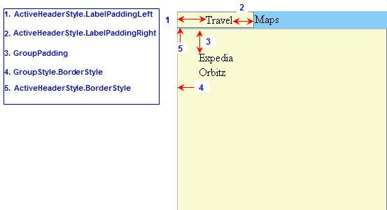
· When a tab header is selected it becomes an active header. In the image below the Travel tab is the active header.
· The image below labels a few of the properties we used in this tutorial. Notice how the LabelPaddingLeft makes 40 pixels of padding before the label/text, Travel. The LabelPaddingLeft and LabelPaddingRight properties make it easy to apply the padding for the tab headers and items as well.
Adding General Styles to the Inactive Tab Headers
Now that you have added styles for the active tab header, you are going to apply some styles to the inactive tab header.
1. Add the following code in the Page_Load procedure to apply the styles to the InactiveHeaderStyle object for the tabstrip.
tabstrip.InactiveHeaderStyle.LabelPaddingLeft = Unit.Pixel(40)
tabstrip.InactiveHeaderStyle.LabelPaddingRight = Unit.Pixel(30)
tabstrip.InactiveHeaderStyle.BorderStyle = BorderStyle.Outset
tabstrip.InactiveHeaderStyle.BorderWidth = Unit.Pixel(1)
tabstrip.InactiveHeaderStyle.BorderColor = Color.LightSkyBlue
tabstrip.InactiveHeaderStyle.BackColor = Color.LightSkyBlue
· C#
tabstrip.InactiveHeaderStyle.LabelPaddingLeft = Unit.Pixel(40);
tabstrip.InactiveHeaderStyle.LabelPaddingRight = Unit.Pixel(30);
tabstrip.InactiveHeaderStyle.BorderStyle = BorderStyle.Outset;
tabstrip.InactiveHeaderStyle.BorderWidth = Unit.Pixel(1);
tabstrip.InactiveHeaderStyle.BorderColor = Color.LightSkyBlue;
tabstrip.InactiveHeaderStyle.BackColor = Color.LightSkyBlue;
· Delphi
tabstrip.InactiveHeaderStyle.LabelPaddingLeft := &Unit.Pixel(40);
tabstrip.InactiveHeaderStyle.LabelPaddingRight := &Unit.Pixel(30);
tabstrip.InactiveHeaderStyle.BorderStyle := BorderStyle.Solid;
tabstrip.InactiveHeaderStyle.BorderWidth := &Unit.Pixel(1);
tabstrip.InactiveHeaderStyle.BorderColor := Color.LightSkyBlue;
tabstrip.InactiveHeaderStyle.BackColor := Color.LightSkyBlue;
2. Add the following code in the Page_Load procedure to apply padding to the items in each group.
tabstrip.Groups(0).ItemStyle.LabelPaddingLeft = Unit.Pixel(20)
tabstrip.Groups(1).ItemStyle.LabelPaddingLeft = Unit.Pixel(20)
· C#
tabstrip.Groups[0].ItemStyle.LabelPaddingLeft = Unit.Pixel(20);
tabstrip.Groups[1].ItemStyle.LabelPaddingLeft = Unit.Pixel(20);
· Delphi
tabstrip.Groups[0].ItemStyle.LabelPaddingLeft := &Unit.Pixel(20);
tabstrip.Groups[1].ItemStyle.LabelPaddingLeft := &Unit.Pixel(20);
Run the Project and Observe the New Styles
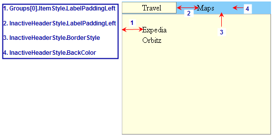
· The following image illustrates the style properties you applied to the inactive tab header and the padding in the items for each group:
Adding Mouseover Styles to the Active and Inactive Tab Headers
You have added styles for the active and inactive tab headers, but now its time to add mouseover styles to the active and inactive headers too. You are going to use the MouseOverActiveHeaderStyle and MouseOverInactiveHeaderStyle properties to apply mouseover styles to the active and inactive tab headers.
Add the following code in the Page_Load procedure to apply the MouseOver styles to the Inactive and Active tab headers.
tabstrip.MouseOverActiveHeaderStyle.LabelPaddingLeft = Unit.Pixel(40)
tabstrip.MouseOverActiveHeaderStyle.LabelPaddingRight = Unit.Pixel(30)
tabstrip.MouseOverActiveHeaderStyle.BorderStyle = BorderStyle.Outset
tabstrip.MouseOverActiveHeaderStyle.BorderWidth = Unit.Pixel(1)
tabstrip.MouseOverActiveHeaderStyle.BorderColor = Color.LightYellow
tabstrip.MouseOverActiveHeaderStyle.BackColor = Color.LightYellow
'Add the property styles to the MouseOverInactiveHeaderStyle object
tabstrip.MouseOverInactiveHeaderStyle.LabelPaddingLeft = Unit.Pixel(40)
tabstrip.MouseOverInactiveHeaderStyle.LabelPaddingRight = Unit.Pixel(30)
tabstrip.MouseOverInactiveHeaderStyle.BorderStyle = BorderStyle.Solid
tabstrip.MouseOverInactiveHeaderStyle.BorderWidth = Unit.Pixel(1)
tabstrip.MouseOverInactiveHeaderStyle.BorderColor = Color.LightSkyBlue
tabstrip.MouseOverInactiveHeaderStyle.BackColor = Color.LightSkyBlue
· C#
tabstrip.MouseOverActiveHeaderStyle.LabelPaddingLeft = Unit.Pixel(40);
tabstrip.MouseOverActiveHeaderStyle.LabelPaddingRight = Unit.Pixel(30);
tabstrip.MouseOverActiveHeaderStyle.BorderStyle = BorderStyle.Outset;
tabstrip.MouseOverActiveHeaderStyle.BorderWidth = Unit.Pixel(1);
tabstrip.MouseOverActiveHeaderStyle.BorderColor = Color.LightYellow;
tabstrip.MouseOverActiveHeaderStyle.BackColor = Color.LightYellow;
//Add the property styles to the MouseOverInactiveHeaderStyle object
tabstrip.MouseOverInactiveHeaderStyle.LabelPaddingLeft = Unit.Pixel(40);
tabstrip.MouseOverInactiveHeaderStyle.LabelPaddingRight = Unit.Pixel(30);
tabstrip.MouseOverInactiveHeaderStyle.BorderStyle = BorderStyle.Solid;
tabstrip.MouseOverInactiveHeaderStyle.BorderWidth = Unit.Pixel(1);
tabstrip.MouseOverInactiveHeaderStyle.BorderColor = Color.LightSkyBlue;
tabstrip.MouseOverInactiveHeaderStyle.BackColor = Color.LightSkyBlue;
· Delphi
tabstrip.MouseOverActiveHeaderStyle.LabelPaddingLeft := &Unit.Pixel(40);
tabstrip.MouseOverActiveHeaderStyle.LabelPaddingRight := &Unit.Pixel(30);
tabstrip.MouseOverActiveHeaderStyle.BorderStyle := BorderStyle.Outset;
tabstrip.MouseOverActiveHeaderStyle.BorderWidth := &Unit.Pixel(1);
tabstrip.MouseOverActiveHeaderStyle.BorderColor := Color.LightYellow;
tabstrip.MouseOverActiveHeaderStyle.BackColor := Color.LightYellow;
tabstrip.MouseOverInactiveHeaderStyle.LabelPaddingLeft := &Unit.Pixel(40);
tabstrip.MouseOverInactiveHeaderStyle.LabelPaddingRight := &Unit.Pixel(30);
tabstrip.MouseOverInactiveHeaderStyle.BorderStyle := BorderStyle.Solid;
tabstrip.MouseOverInactiveHeaderStyle.BorderWidth := &Unit.Pixel(1);
tabstrip.MouseOverInactiveHeaderStyle.BorderColor := Color.LightSkyBlue;
tabstrip.MouseOverInactiveHeaderStyle.BackColor := Color.LightSkyBlue;
end;
Run the Project and Observe the Mouse-Over Styles
· When you mouse over the active header the same property styles are present from the ActiveHeaderStyle object since we applied the same styles for both.
· This is also true for the MouseOverInActiveHeaderStyle object.
· The same property styles for the MouseOverActiveHeaderStyle/ActiveHeaderStyle and MouseOverInactiveHeaderStyle/InactiveHeaderStyle are applied for consistency. As you can see using consistent styles for the ActiveHeader and InactiveHeaderStyles improved the appearance of the tabstrip.
Congratulations for your Successful Completion of this Lesson!
In this tutorial you learned how to programmatically create an instance of the C1WebTabStrip class, add styles and GroupStyles to the C1WebTabStrip, and add general styles and mouseover styles to the active and inactive headers of the C1WebTabStrip.
If you would like to learn how to create the same styles using a Cascading Style Sheet instead, you can try the following lesson: Adding CSS Styles to C1WebTabStrip.
Send comments about this topic to ComponentOne. Copyright © ComponentOne LLC. All rights reserved. |