Chart Type
Description
Area
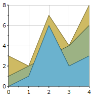
An Area chart displays a series as a set of points connected by a line, with all the area filled in below the line. Area charts are commonly used to represent data that occurs over a continuous period of time.
AreaSmoothed
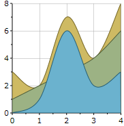
An AreaSmoothed chart is an area chart where the data points are connected by a smooth line instead of a regular line. This chart is used to display trends rather than values of individual data points.
AreaStacked
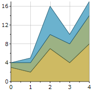
An AreaStacked chart shows multiple series stacked vertically. If there is only one series in the chart, the stacked area chart will display the same as an area chart.
AreaStacked100pc
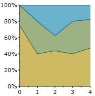
An AreaStacked100pc chart shows an area chart where multiple series are stacked vertically to fit 100% of the chart area. If there is only one series in your chart, the stacked area chart will display the same as an area chart.
Bar
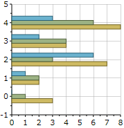
A Bar chart displays series as sets of horizontal bars. The bar chart is the only chart type that displays data horizontally. For this reason, it is popular for representing data that occurs over time, with a finite start and end date. It is also popular for showing categorical information since categories can be displayed horizontally.
BarStacked
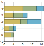
A BarStacked chart shows multiple series stacked vertically. If there is only one series in the chart, the stacked bar chart will display the same as a bar chart.
BarStacked100pc
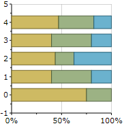
A BarStacked100pc chart shows a column chart where multiple series are stacked vertically to fit 100% of the chart area. If there is only one series in your chart, all bars will fit to 100% of the chart area.
Bubble
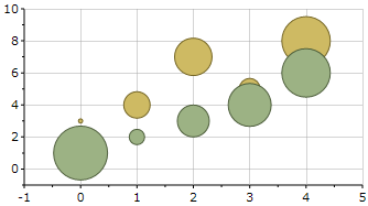
A Bubble chart combines two independent values to supply both the point y value and the point sizes. This chart is used to represent an addition data value at each point by changing its size.
Candle
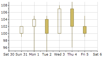
Candle and HiLoOpenClose charts are types of Stock charts used in financial applications to show the opening, closing, high, and low prices of a given stock. A Candle chart is a special type of HiLoOpenClose chart. It represents the change in stock price from opening to closing.
Column
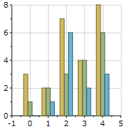
A Column chart displays a series as a set of vertical bars that are grouped by category. Column charts are useful for showing data changes over a period of time or for illustrating comparisons among items.
ColumnStacked
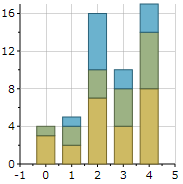
A ColumnStacked chart shows multiple series stacked vertically. If there is only one series in the chart, the stacked column chart will display the same as a column chart.
ColumnStacked100pc
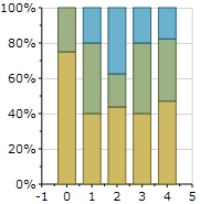
A ColumnStacked100pc chart shows a column chart where multiple series are stacked vertically to fit 100% of the chart area. If there is only one series in your chart, all the column bars will fit to 100% of the chart area.
Gantt
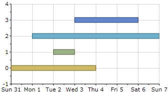
A Gantt chart is used to illustrate a timeline of various tasks and outline the critical activities to a project's completion.
HighLowOpenClose
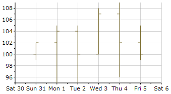
Candle and HiLoOpenClose charts are types of Stock charts used in financial applications to show the opening, closing, high, and low prices of a given stock. This chart combines four independent values to supply high, low, open and close data for a point in a series.
Line
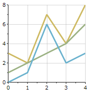
A Line chart displays a series as a set of points connected by a single line. Line charts are used to represent large amounts of data that occur over a continuous period of time.
LineSmoothed
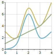
A LineSmoothed chart is a Line chart that uses a curved line instead of a regular line.
LineStacked
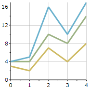
A LineStacked chart shows multiple series stacked vertically. If there is only one series in the chart, the stacked line chart will display the same as a line chart.
LineStacked100pc
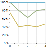
A LineStacked100pc chart shows a line chart where multiple series are stacked vertically to fit 100% of the chart area. If there is only one series in your chart, all lines will fit to 100% of the chart area.
LineSymbols
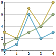
A LineSymbols chart displays a series as a set of points connected by a single line. A filled circle appears at each data point.
LineSymbolsSmoothed
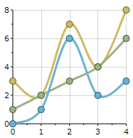
A LineSymbolsSmoothed chart is a LineSymbols chart that uses a curved line instead of a regular line.
LineSymbolsStacked
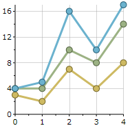
A LineSymbolsStacked chart shows multiple series stacked vertically. If there is only one series in the chart, the stacked line chart will display the same as a line chart. A filled circle appears at each data point.
LineSymbolsStacked100pc
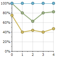
A LineSymbolsStacked100pc chart shows a LineSymbols chart where multiple series are stacked vertically to fit 100% of the chart area. If there is only one series in your chart, all lines will fit to 100% of the chart area.
Pie
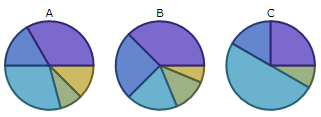
A Pie chart draws each series as a slice in a pie. The number of pies is the number of points in the data.
PieDoughnut
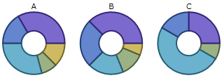
A PieDoughnut is a pie chart that has an open space in the center.
PieExploded
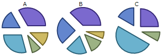
A PieExploded chart is a pie chart where all of the slices are moved away from the center of the pie.
PieExplodedDoughnut
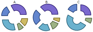
A PieExplodedDoughnut chart is a chart where all of the slices are moved away from the center of the doughnut.
PolarLines
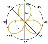
A Polar chart is a circular grid that uses polar, rather than Cartesian coordinates. A PolarLines chart plots the angles using only lines.
PolarLinesSymbols
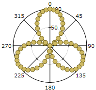
A PolarLinesSymbols chart plots the angles using lines and dot symbols.
PolarSymbols
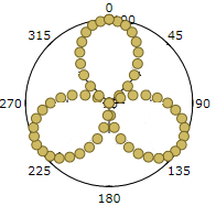
A PolarSymbols chart plots the angles using dot symbols.
Radar
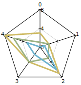
A Radar chart draws the y value in each data set along a radar line (the x value is ignored except for labels).
RadarFilled
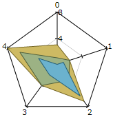
A RadarFilled chart is a Radar chart with the radar lines filled in.
RadarSymbols
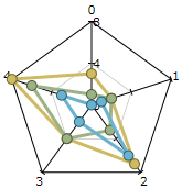
A RadarSymbols chart is a Radar chart that draws the y value in each data set along a radar line (the x value is ignored except for labels). A filled circle appears at each data point.
Step
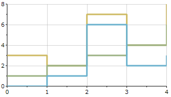
Step charts are good for showing values that change over time, like interest rates. A Step chart will display this information using only lines.
StepArea
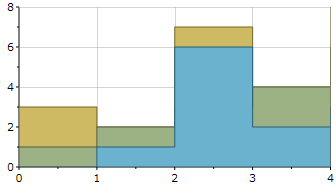
A StepArea chart will display data with the Step lines filled in.
StepSymbols
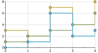
A StepSymbols chart will display data using dot symbols and lines.
XYPlot
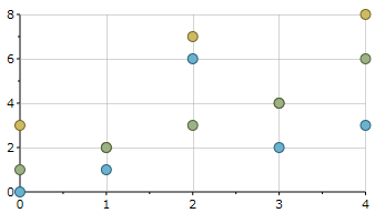
XYPlot charts draw each series as connected points of data.