Creating Aggregate Charts
You can create charts that summarize data in a variety of ways. You can
perform calculations such as average, sum, and count on your data to show useful
summary charts. You don’t need to set up calculations in the source data, just
choose the column you would like to group by, then select the appropriate
calculation. For example, the chart below shows the aggregation
of widgets, gadgets, and trinkets sold in Canadian provinces for a
selected time period. All of this data was pulled from a single data
source.

To create an aggregate chart
- Create a basic chart. (See Using the C1Chart Web Part.)
- Open the On-Board Designer. (See Using the On-Board Designer.)
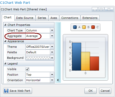
- On the Chart tab, specify the type of aggregation in the
Aggregate drop-down.
- Sum = Sum all values for each point.
- Count = Number of values for each
point
- Average = Average all values for each
point
- Minimum = Get the minimum value for
each point
- Maximum = Get the maximum value for
each point
- Variance = Gets the variance of the
values for each point (sample)
- VariancePop = Gets the variance of the
values for each point (population)
- StandardDeviation = Gets the standard
deviation of the values for each point (sample)
- StandardDeviationPop = Gets the
standard deviation of the values for each point (population)

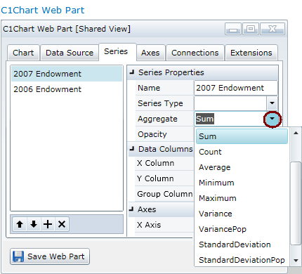
- Click the Series tab. Select the data series
you've already created on the left, and choose the Aggregate
for it on the right.

- If you'd like to add an additional data series, click the plus sign on the
lower left and in the Name field enter the name for your new
data series.
- For the Data Columns, set the following:
- In the Series Properties section, choose the
Aggregate for it on the right.
Note: You can't specify Series Types
(for example, Pie and Column) and Aggregations (for
example, Average and StandardDeviation) that
are radically different.
You can customize the axis properties for your aggregated chart, see Customizing Each Axis of Your
Chart.


