Creating Charts with Multiple Data Series
You can create charts that compare data by overlaying multiple series on a
single chart. These are called multiple data series charts. These are called
multiple data series charts.
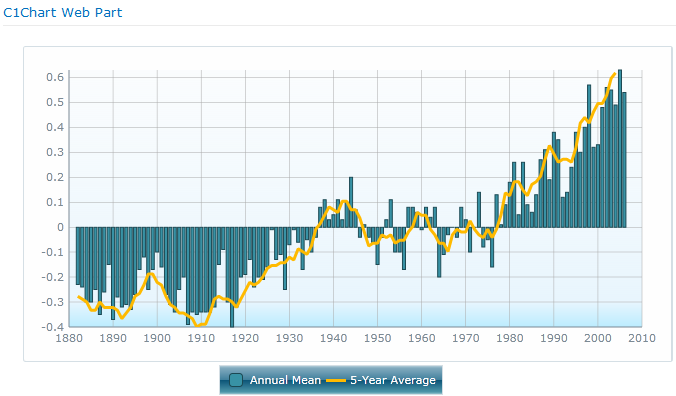
In the example below, the C1Chart displays global temperature data plotted
over time using a column chart and a line chart.

To create a chart with multiple data series
- Create a basic chart. See Using the C1Chart Web Part.
- Open the On-Board Designer. (See Using the On-Board Designer.)
- Click the Series tab. Select the data series
you've already created on the left, and choose a Series Type
for it on the right. That data set will be displayed as the type of
Chart selected. (Column chart, Bar chart, etc.)
- Click the plus sign on the lower left and in the Name
field enter the name for your new data series.
- For the Data Columns, set the following:
If you
select a Group Column field, a separate data series will
be displayed for each distinct value in that column. This is not the same as
aggregation, which creates a data point along the X-axis for each
distinct X column value. You can combine column grouping with aggregation
if you wish. See Creating Aggregate
Charts.
- In the Axes section, select the X and Y
Axis for the Data Columns. You have the choice of Primary
or Secondary. What you choose depends on how you
want your data to display.
-
For example:
- You have plotted the University
endowments for 2007 as a Column chart, with
Institution as the X Column and
2007 Endowments as the Y Column. (The
X and Y Axes are both
Primary.)
- You have plotted University Endowments for 2006 as a
Line chart, with Institution as the X Column
and 2007 Endowments as the Y
Column.
If you would like the 2006 Endowment information to be
plotted on top of the 2007 information to illustrate the
increases and decreases, for the 2006 information, choose the X Axis
of Primary and the Y Axis of
Secondary.
Note: The Opacity of the Data
Series is the transparency. The default is 1, which is 100%. Reduce it to make a
series more transparent.

