ComponentOne Grid for WPF includes the C1DataGrid control, which provides a flexible, customizable grid. When you add the C1DataGrid control to a XAML window, it exists as a completely functional grid that allows end users to add, edit and manage data. If you choose to, you can drop the control onto your window, bind the grid, and be done. But while the initial grid is quite flexible, it uses a default interface. You can further customize this interface to fit your users' needs by using themes, data views, and by customizing the grid's appearance and behavior with templates.
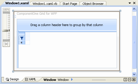
The default user interface looks like the following image in Design view in Visual Studio 2008:

|
