C1Chart Quick Start
The C1Chart Web Part Quick Start shows you how to create a column chart that
displays the universities with the top 10 endowment funds for a given year (in
this case, 2007).

This Quick Start uses the Endowments list. If you have not created this list,
see Quick Start for
instructions.
How it works:
The Endowments List contains the names (the Institution column), state, 2007
and 2006 endowments, and endowment ranking of 785 universities. It
also contains the percentage change in endowments for each between
2006 and 2007.
This Quick Start uses the Institution,
Rank, and 2007 endowment information from the
list.
- The Web Part pulls the Universities with the top 10 endowments using
filtering (there are 700+ institutions in the list).
- The Web Part displays the information we want to display (the universities
and the dollar amount) on the axis we choose.
- The Web Part makes cosmetic changes to make the chart easier to understand
and more professional looking — the university names are set at an angle,
the legend is moved to the top, and the raw numbers are displayed as
currency.
To create a Chart
- Add the C1Chart Web Part to the page. (See Adding a Web Part to a
Page.)
- Open the On-Board Designer. (See Using the On-Board Designer.)
- Click the Data Source tab.
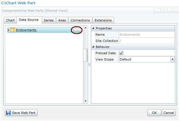
- Choose the Endowments List.

- The Endowments list has 785 institutions (too many for this chart) so we
need to pare it down to the institutions with the top 10 endowments. To do
that, we filter the list. Click the ellipsis next to the
Endowments list. The columns in the list will be displayed.
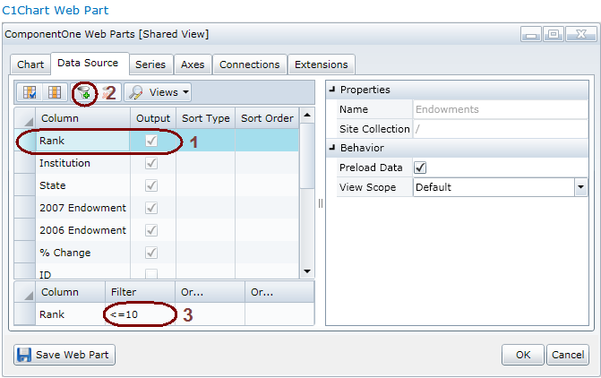
- Select Rank, then click the Filter
button. In the Filter field, enter
<=10.

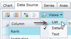
- Click the Views button and choose List
to return to the previous display.

- Click OK.
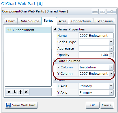
- Now we need to name the data series and choose the X and Y axis of the
chart. Click the Series tab. Click the plus sign on the lower
left and give the series the name of 2007 Endowment. For
the Data Columns, set the following:
- X Column = Institution
- Y Column = 2007 Endowment
- Click OK.
This will put the Institutions on the X
Axis and the 2007 Endowments on the
Y Axis.

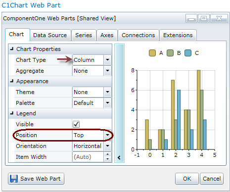
- The Legend should be at the top of this chart, so we need
to move it from its default position (the bottom). Click the Chart
tab and in the Legend area, change the
Position to Top.
While you are there, note that the Chart Type is
Column, which is the default.

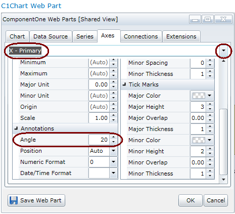
Two tweaks to the Axes tab information and we are done. First of all, we
would like the Universities in the X axis to display at an angle so they are
easier to read.
- Click the Axes tab and choose X axis
from the drop-down at the top.
- In the Annotations area, enter 20 for
the Angle. Click OK.

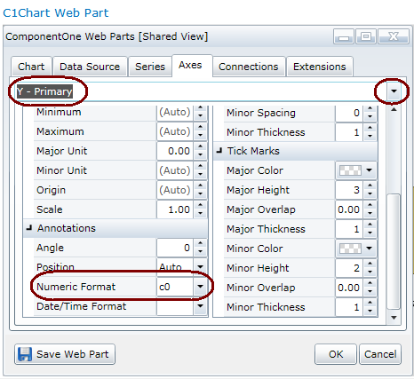
- Now we want the dollar amounts displayed on the Y axis to be displayed as
currency. Choose the Y axis at the top and in the
Annotations area, choose Currency as
the Numeric Format. (This tells the Web Part to display the
numbers in the 2007 Endowment column as dollars.)

- Click the Save Web Part button.
If you'd like your chart to be more exciting than plain old beige,
try changing the Theme or the Palette. The
C1Chart Web Part has 11 themes and 20 palettes. They are set on the
Chart tab (in the Appearance section.)
The result:
- A Column chart is created.
- The chart displays the universities with the top ten endowments on the X
axis.
- The Y axis displays the dollars in increments of 5 million.
- The legend for the chart is on the top.
- University names are displayed at an angle for easy readability.


