Customizing the Behavior and Display of Your Grid
By default, end users can manipulate a C1DataGrid in a number of ways. They
can sort, filter, edit, resize columns and rows and more.
However, you can control the level of interaction with your C1DataGrid, and
the display of the columns and rows. These items are controlled using the
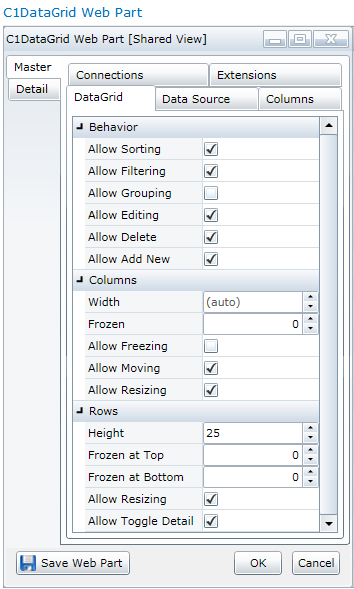
DataGrid tab. You can set these fields for both the Master and
the Detail grid (Detail grids are only used in Hierarchical Grids, see Creating a
Hierarchical Grid.)
To customize your DataGrid's behavior and
display
- Open the On-Board Designer. (See Using the On-Board Designer.)
- Click the DataGrid
tab.
To control:
- Sorting of columns — use the Allow Sorting
check box
- Filtering of columns — use the Allow
Filtering check box
- Grouping of columns — use the Allow
Grouping check box
- Editing the grid— use the Allow Editing
check box
- Deleting rows from the grid — use the
Allow Delete check box
- Adding new rows to the grid — use the Allow Add
New check box
- Moving and resizing of columns — in the Columns
section, use the Allow Moving and Allow
Resizing check boxes.
- Resizing of rows — in the Rows
section, use the Allow Resizing check box.
- Ability to view the detail information in a
hierarchical grid — in the Rows section, use the
Allow Toggle Detail check box. If this check box is
cleared, the user will not see the detail button
 , so
they can't view the detail information.

There are a few other Column and Row settings that control width and
height.
In the Columns area, you can:
- Allow the freezing of columns (frozen columns will not
move when the grid is scrolled) — use the Allow Freezing
check box
- Choose the columns to freeze — use the
Frozen field. The number of columns entered will be
frozen, starting with the columns on the left.
- Set a standard width for all columns (in pixels) —
use the Width field (to reset the width, select the number
and click the Delete button to return the width to
(auto))
In the Rows area you
can:
- Set a standard height for all rows (in pixels) — use
the Height field.
- Choose the number of rows to freeze at the top of the
grid (frozen rows will not move when the grid is scrolled) — use the
Frozen at Top field
- Choose the number of rows to freeze at the bottom of
the grid — use the Frozen at Bottom field
- Set the initial view for grouped rows (collapsed
or expanded) — use the Initial Grouping drop-down.
(The Group Order for the columns must be set in the Columns tab
first. See To
customize individual columns for information about setting the
Group Order for columns.)
- Click the Save Web Part button.
Please note: You can set some of these options by
column using the Columns tab.
To customize individual columns
This is the place to fine-tune individual columns in your grid.
If you have created a hierarchical grid, you can customize both the
Master and the Detail columns.
- Open the On-Board Designer. (See Using the On-Board Designer.)
- Click the Columns tab.
- Select the column you would like to customize on the
left.
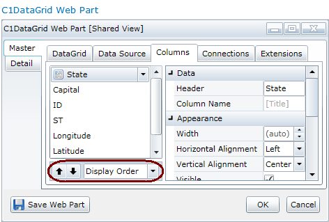
You can change the default order of the columns here. Use the up and
down arrows to set the Display Order. If you would like
to remove or hide a column in your C1DataGrid, see Selecting the Data
to Display.
In addition to Display Order, you can also set the
Group Order to create expandable groups of
like-valued cells within one or more columns. Choose Group Order
from the drop-down at the bottom. Then select each column(s) and
choose Ascending or Descending order from
the drop-down. Your data will be nested in the order
specified.

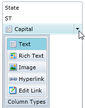
To enable specific column
types, click the drop-down next to the column name and
choose Text, Rich Text, Image, Hyperlink, or Edit Link. Choosing Hyperlink enables the hyperlinks in each cell;
Edit Link
makes each cell in the
column a link that opens the SharePoint editing dialog box. You can
then edit the contents of the row.

- Set the appearance and behavior of the chosen column.
To control:
- The name of the column — use the Header
field
- The width of the column — use the Width
field
- The alignment of the text in the column — use the
Horizontal and Vertical Alignment fields
- Whether the column is visible — use the Visible
check box (For more on removing or hiding columns, see Selecting the Data
to Display.)
- Text wrapping — use the Wrap Text
check box
- Sorting of the column — use the Allow Sorting
check box
- Filtering of the column — use the Allow
Filtering check box
- Moving of the column — use the Allow
Moving check box
- Resizing of the column — use the Allow Resizing
check box
- Editing of the column — use the Allow Editing
check box (The Allow Editing check box must also
be selected in the DataGrid tab or individual columns
cannot be edited.)
- Allow null values in the column — use the
Allow Null Values check box
- When clicking in a cell, the data will be selected
and ready for editing — use the Edit on Selection
check box
If you choose a column that contains numeric data, you can specify the
Numeric format or the Date/Time format. For
more on other standard numeric formats, see http://msdn.microsoft.com/en-us/library/dwhawy9k.aspx. Date/time
standard format information can be found here: http://msdn.microsoft.com/en-us/library/az4se3k1(VS.71).aspx
- Click the Save Web Part button.
 , so
they can't view the detail information.