ComponentOne Grid for WPF allows you to create customized, rich grid applications. Make the most of Grid for WPF by taking advantage of the following key features:
• Multiple Data Views
Change the appearance of Grid for WPF with multiple built-in unique data views or create your own custom data view. For example, a customized carousel data view:

Built-in data views include a:
• Tabular view with vertical row distribution
• Tabular view with horizontal row distribution
• Card view
• Carousel view
You can also create your own views, fully customizing user interface elements. For example, customize the item, header, group by area, and item cells, and define an arbitrary item distribution panel, current item, sort indicators, and much more. For more information, see Using Data Views.
• 13 Built-In Themes for Easy Customization
Customize the appearance of your grid application with built-in Office 2007, Vista, and Office 2003 themes, or create your own theme based on the included themes. For more information about available themes and using themes in your grid, see the Using Themes topic.
• Automatic and Explicit Column Generation
Automatically generate columns in the grid or explicitly define columns – you can even explicitly define columns in an automatically generated grid. Automatic column generation is based on source list item properties, including support for the ADO.NET DataSet or any ITypedList source. By default the AutoGenerateColumns property is set to True and all columns, even those undefined in the Columns collection, are generated automatically. If set to False, only those columns defined in the Columns collection are shown. For an example of explicitly defining columns in the grid, see Adding Columns to the Grid.
• Universal Data Binding
Bind the C1DataGrid control to any object that implements the System.Collections.IEnumerable or System.ComponentModel.IListSource interface. For more information, see Binding Grid for WPF to a Data Source.
• Universal Item Templates
Define a custom content layout for multiple grid parts (such as data item, header, and filter bar) in a single template with supported universal item templates. For more information, see Using the UniversalItemContentTemplate.
• Virtual Grid Item Generation
Grid for WPF supports user interface virtualization – by processing only information loaded in the viewable area UI virtualization speeds up the user interface generation when working with a large source list.
• Run-time Interaction
Easily group, sort, filter, resize, and reorder columns at run time all through simple drag-and-drop operations. For more information, see Run-Time Interaction.
• Split Creation
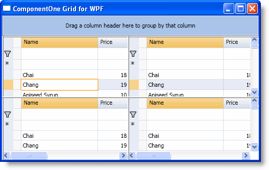
At run time users can easily create and resize Excel-like horizontal and vertical splits that you can customize at design time. For more information about using splits at run time see Creating Splits.

• Hierarchical Data Representation
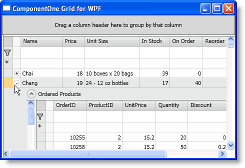
Grid for WPF supports automatic hierarchical data representation; so, for example, when the grid is bound to a table with a child table, users can expand the child table under the current table to see related data. See Viewing Child Tables for more information.

• Simplified Layout Customization
Grid for WPF incorporates simplified grid item and grid header cells layout customization, defining cell placement by specifying panel-specific attached properties on a column. This layout customization can be used in conjunction with Grid (Column, Row, ColumnSpan, and RowSpan properties), Canvas (Left and Top properties), and other panels that define child element placement via attached properties. See Simplified Cell Layout in a Panel for more information.
• Column Data Type to Cell Template Mapping
Define a cell show and edit template for a data type in a single place and set it so it affects all the columns of that type in a specific grid, all of the grids on a Page, or even all of the grids in an application. Grid for WPF can declaratively describe a mapping between a data type represented by a grid Column and an item cell template used to define the UI for cell viewing and editing, giving you more control over how data is displayed.
• Unified Underlying Data Access Model
Grid for WPF incorporates a unified underlying data access model where an underlying data source is wrapped by a Rows[i].Cells[j] object model, which gives unified read-write access to a grid's source list data, without needing to consider data source specifics.
• Auxiliary XAML Elements
Auxiliary XAML elements simplify the creation of an arbitrary user interface. See XAML Elements for more information.
• Unbound Grids and Columns
Use C1DataGrid with unbound data, even adding unbound columns to a bound grid. For an example of adding an unbound column to the grid, see Adding Columns to the Grid.
• Automatic Totals Calculation
You can now add totaling to columns in your grid. Easily total columns with sum, average, minimum, maximum, and count functions, or create your own custom totals function. See the Calculating Column Totals topic and the Totals property description for details.
• Column Formatting
You can easily format a column as, for example, date, percent, currency, or so on using the Format property. For an example, see Formatting a Column as Currency. You can also format how columns appear depending on their DataType – for more information, see Using Type Based Column Styles.
|
