If you have a data set and the C1Olap Web Part, you can create and display a grid and chart that provides useful insight into that data set, while at the same time making it possible for anybody to analyze that data on-the-fly. A grid and chart are created at the same time, based on the criteria specified.
With the C1Olap Web Part, exposing data trends and patterns is easy. All you need to do is drag-and-drop fields and set parameters with right-click menus. If you’d like, you can refine the look of your grid and chart by customizing it further.
Maybe you’ve never heard of OLAP, so let’s step back for a minute and talk about it. OLAP means “Online Analytical Processing.” Typical OLAP tools include the "OLAP cubes" and pivot tables you may have seen in Microsoft Excel. OLAP makes it possible to take a large set of flat, raw data and summarize it by grouping information based on a set of criteria. With the C1Olap Web Part, you can pivot large data sets without cubes, development, or special database tools. There is no need to manually create individual spreadsheets that are impossible to keep updated and difficult to analyze accurately.
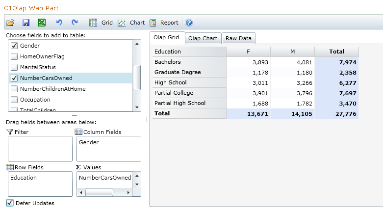
Here’s an example: if you had a large set of general demographics data, you could find out who buys the most cars, based on their gender and level of education. Here’s one way the grid could look ...

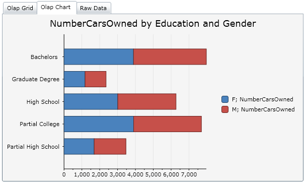
... and here is the chart. They are created simultaneously.

If you wanted to break this down further, and see if marital status makes a difference in car ownership, you could add that to your criteria. Don’t care about car ownership, but home ownership instead? OLAP makes it possible. The ways to slice and dice data are almost unlimited.
The C1Olap Web Part makes it possible to provide end-users with:
No spreadsheets and custom coding – and more importantly, no constraints.
To set up the C1Olap Web Part, see Getting Started with C1Olap.
For an overview of the C1Olap Web Part, see Tour of C1Olap.